Pigeon Simulator DevLog - January 2023
Refreshed from our holiday break, we came back to the studio more energetic than ever and touched on nearly every aspect of the game!
It finally feels like we’ve settled on core game loops, player progressions, and narrative structures that will deliver really solid gameplay experiences that are substantially and meaningfully different to every player. Creating a single-player game that is both content and systems-driven is no small task, but it looks like all of our ambitious design ideas are coming together in a way that is very exciting. So much potential!
On the technical front, we’ve made great improvements to our procedural generation systems, improved performance, and build stability. We’ve also moved to a monthly dev cycle in preparation for playtesting (coming soon)!
Placeholder art is getting swapped out with final, beautiful assets nearly every day, and the overall graphics quality of the game continues to evolve. This includes a growing, crazy cast of characters, ready to be included in a bunch of handmade quests and emergent gameplay scenarios.
We’ve got a lot of work ahead of this year, but I’d say we’re off to a really great start thanks to such an amazing team! Here’s the highlights of what we’ve been up to this past month.
— Jed ‘HakJak’ Steen
RPiGeon
Dylan Valev
This month we focused on connecting our RPG elements to permanent player progression, encompassing pigeon builds, DNA kits, and level progress! Additionally, all of our DNA abilities now associate with just one player stat (Swoleness, Thiccness, Marbles, or Speeeed). In doing so, each stat will have a stronger identity and feel more impactful.
We’ve also been touching up the menus to better reflect gameplay updates, such as The Flux Warbler. Now our future space station hub updates can hit the ground running!
What is “The Flux Warbler” and why is everything all sci-fi looking? Follow our socials for more info soon!
A Shocking Update!
Dylan Valev
Along with our DNA updates, the Shocked status effect also had a power up. When characters are shocked, they will be stunned for a brief period of time and fully zap any other surface that comes into contact with them, creating an electrifying chain.
In order to make this mechanic feel more dynamic, characters will now take continuous electric damage while shocked (akin to a poison effect), and transfer a portion of their current charge to other collided objects in a wave of energy (as opposed to a constant growth). This invites more tactility for shock-inducing abilities, such as zapping currency from ATMs, turning a water fountain lethal, or setting up traps for pedestrians! Meowza!
Fem Fatales & Hand-drawn UI Updates
Emma Lowry
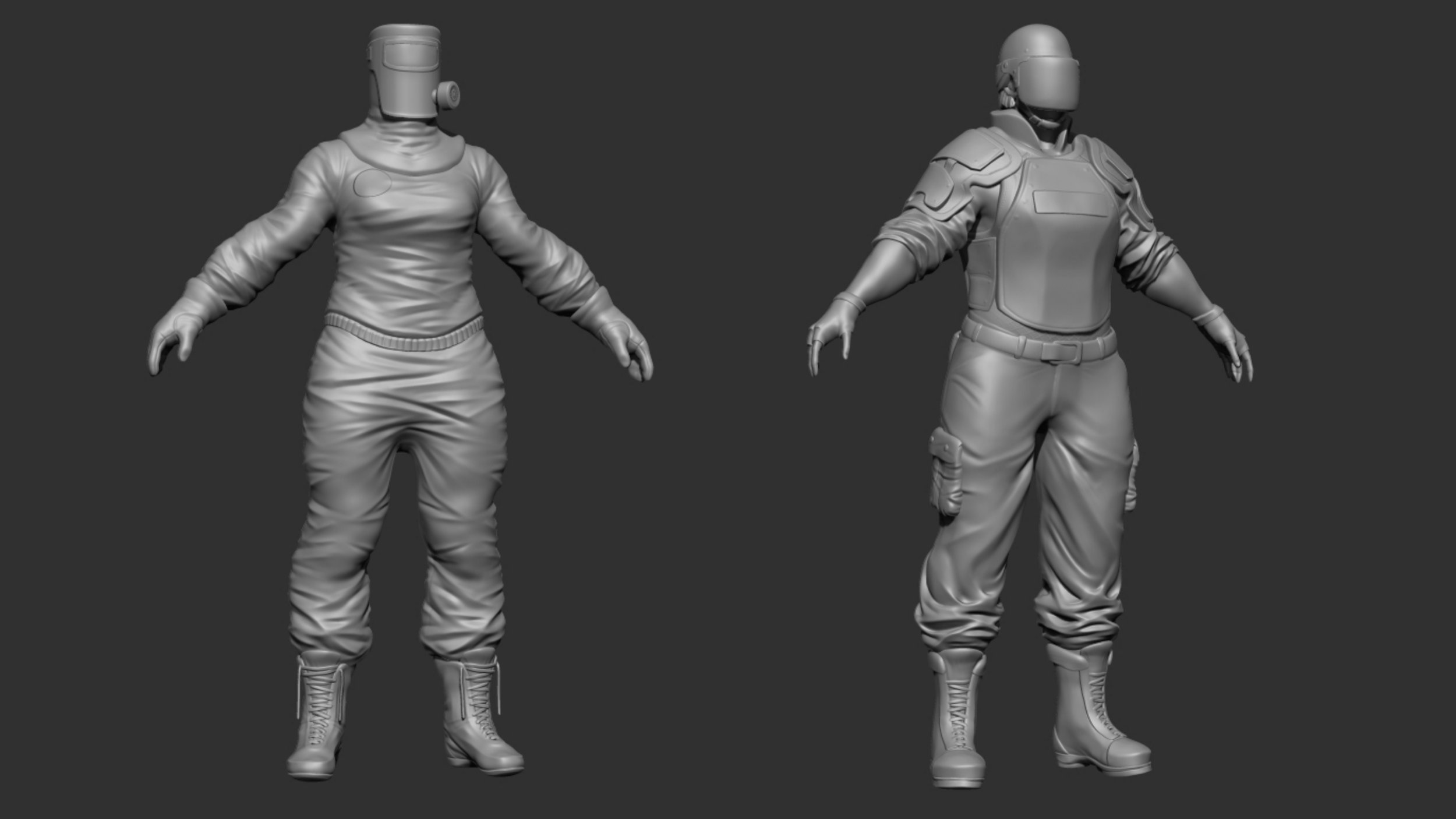
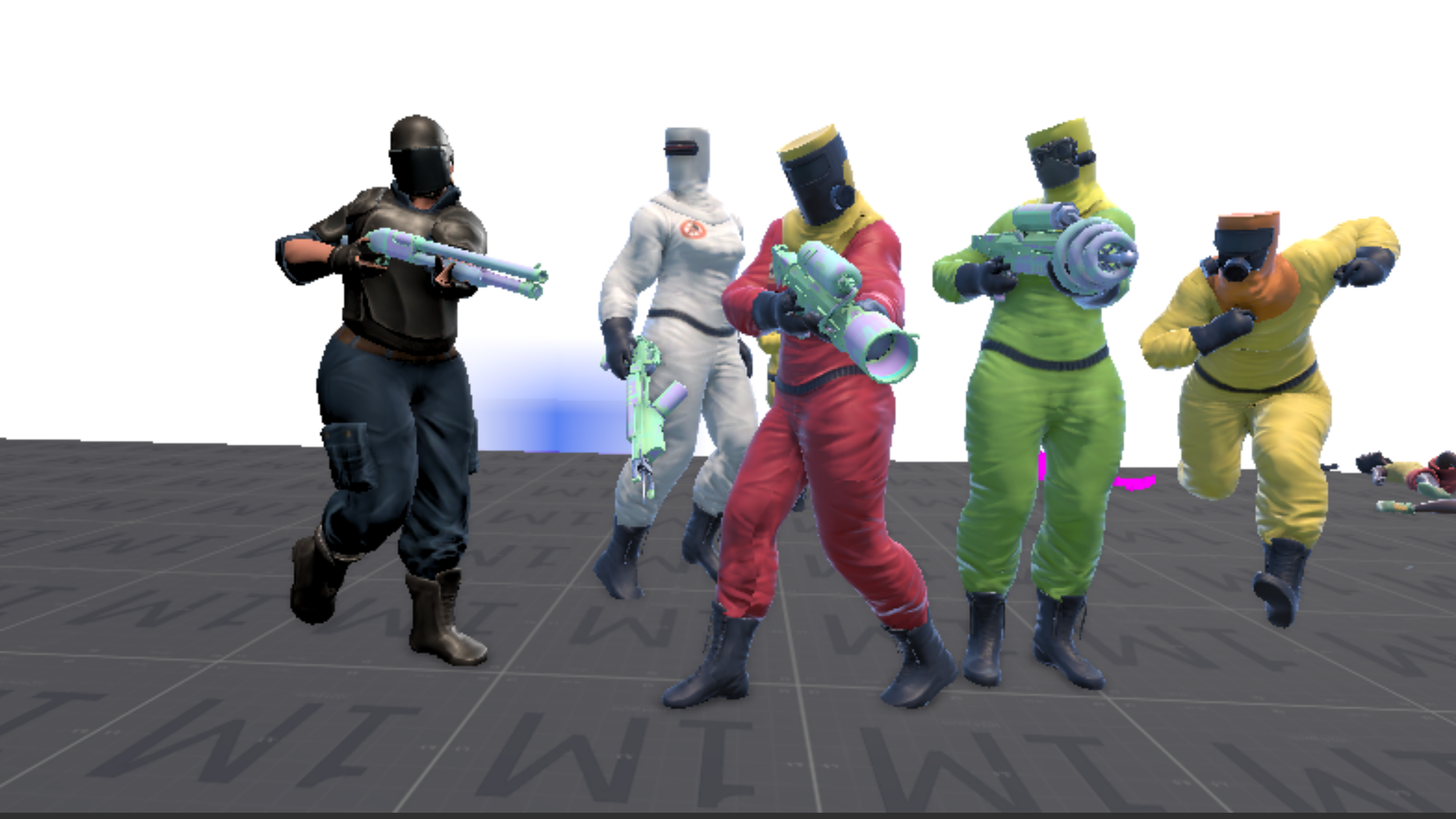
This month, I tackled a couple different things. First, I created female versions of our “brute” enemy archetypes for the Pigeon Patrol and Cop factions. This involved refitting the HAWT unit armor to the female brute base character, and sculpting a fresh Pigeon Patrol jumpsuit. I also added a basic archetype female “hot cop” to match our male “hot cop”.
It felt good to finally expand these factions visually - don’t mess with these powerful ladies!
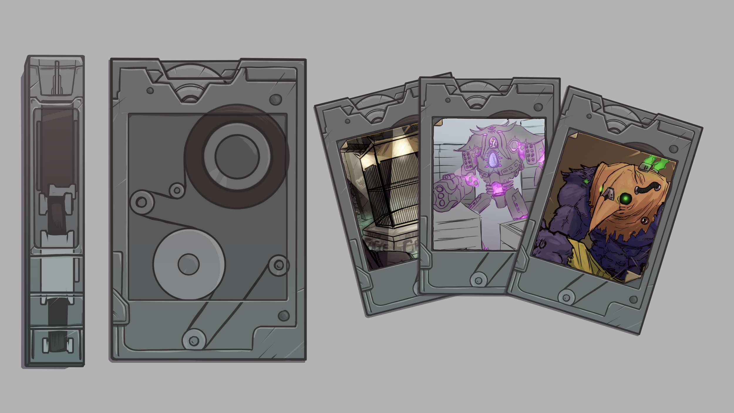
I also worked on some new UI elements! We’re building out some important menus like the Flux Warbler, Pigeon’s primary way of accessing quests, so I polished up our initial Data Tape asset - wonder what sorts of stories these bad boys contain! I also worked on a rough-draft set of assets to start filling in our Flux menu wireframe.
Flux Tapes - a marvel in pigeon science and engineering
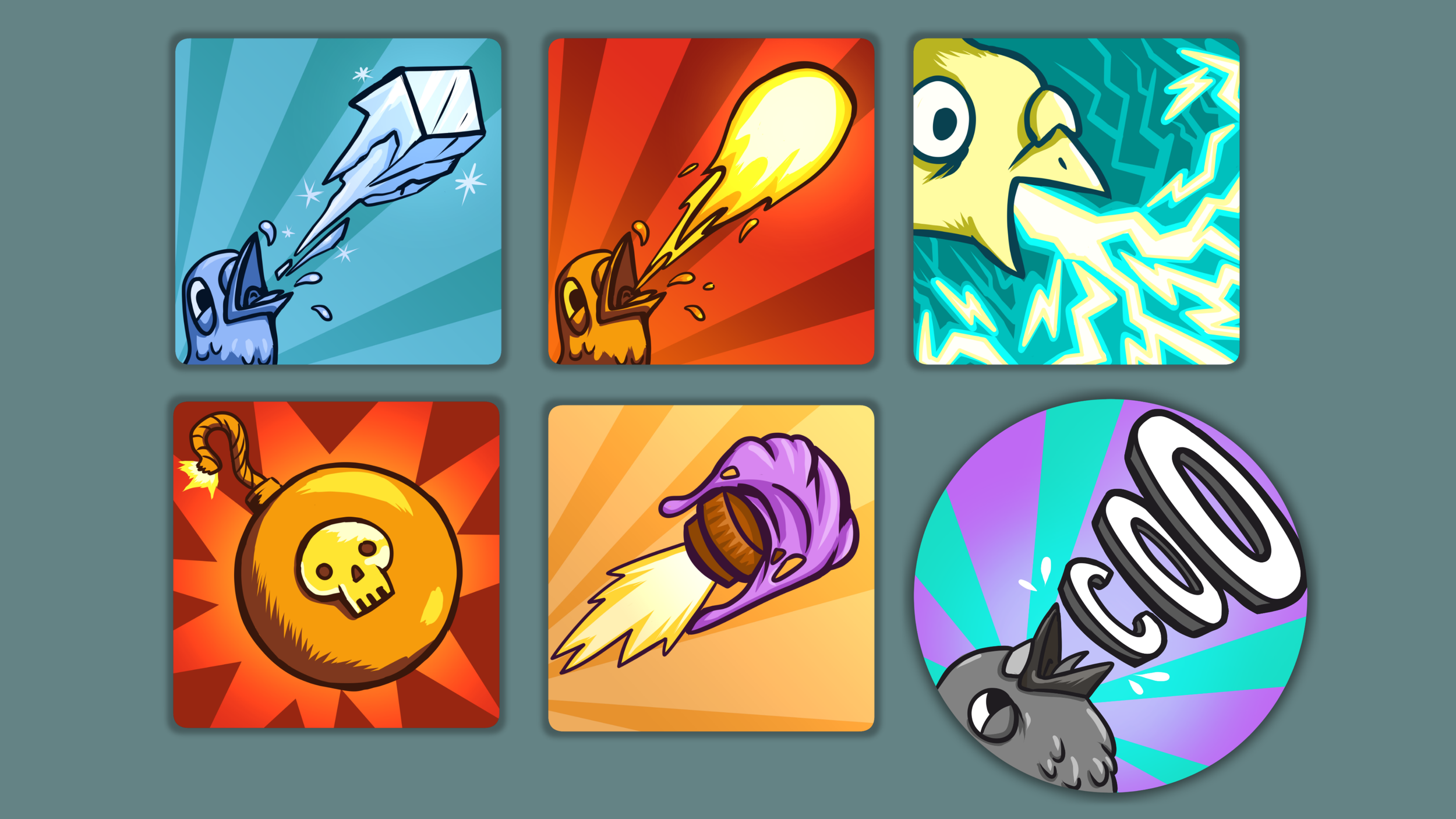
Pigeon Simulator is full of crazy abilities, and each one needs a fun and colorful icon to go along with it. I worked on chipping away at my icon to-do list this month, and got them in game! Each icon pulls from a specific color palette to communicate its place among wild elemental, technological, and bodily(?) power sets. There’s lots to explore.
A sneak peak at a tiny fraction of the crazy abilities you an discover in Pigeon Simulator
Pigeon Controller & Camera Polish
Dean Cohen
The pigeon controller has been in a constant state of tweaks and improvements since the beginning, but this month we’ve given it special attention. We’ve made several important adjustments to the ground and air locomotion systems, making it a breeze to weave in and out of tight spaces, even while flying at high speeds!
We’ve also mapped out some details for new features, like hovering and improved grab/perch mechanics, that have been on everyone’s wishlist for a long time. Shout out to all the folks that have messaged us about adding a hover feature to the game!
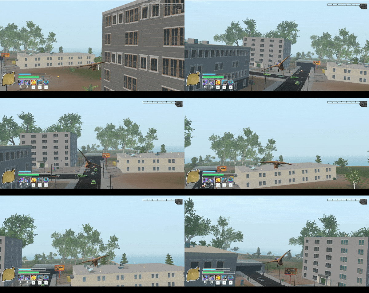
We also added some nice polish to the camera, like this [optional] roll-tilt while banking. Here’s an exaggerated example…
Optional camera tilt setting, for increased flight simulator immersion
Story Swap
Madison Belka
During this month, I took the time to update our story selection system so that it can load and unload quests on the fly.
Once a story is completed, it will notify the system of success or failure. Then when the player isn’t near any of the story elements, it will unload those assets. The number of unloaded stories will then become the number of new stories for the system to load in. This will keep things running fast, while always giving the player new adventures to discover.
The system will now also prioritize stories that are a continuation of previously completed stories.
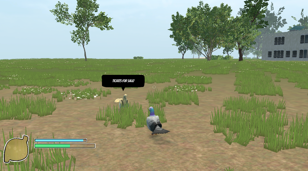
Why’s this pigeon selling tickets way out here in a field? Hmm… seems a little shady.
The Nest 2.0
Aubrey Rugroden
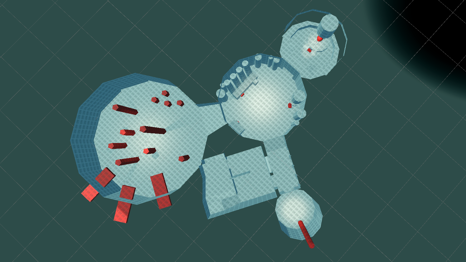
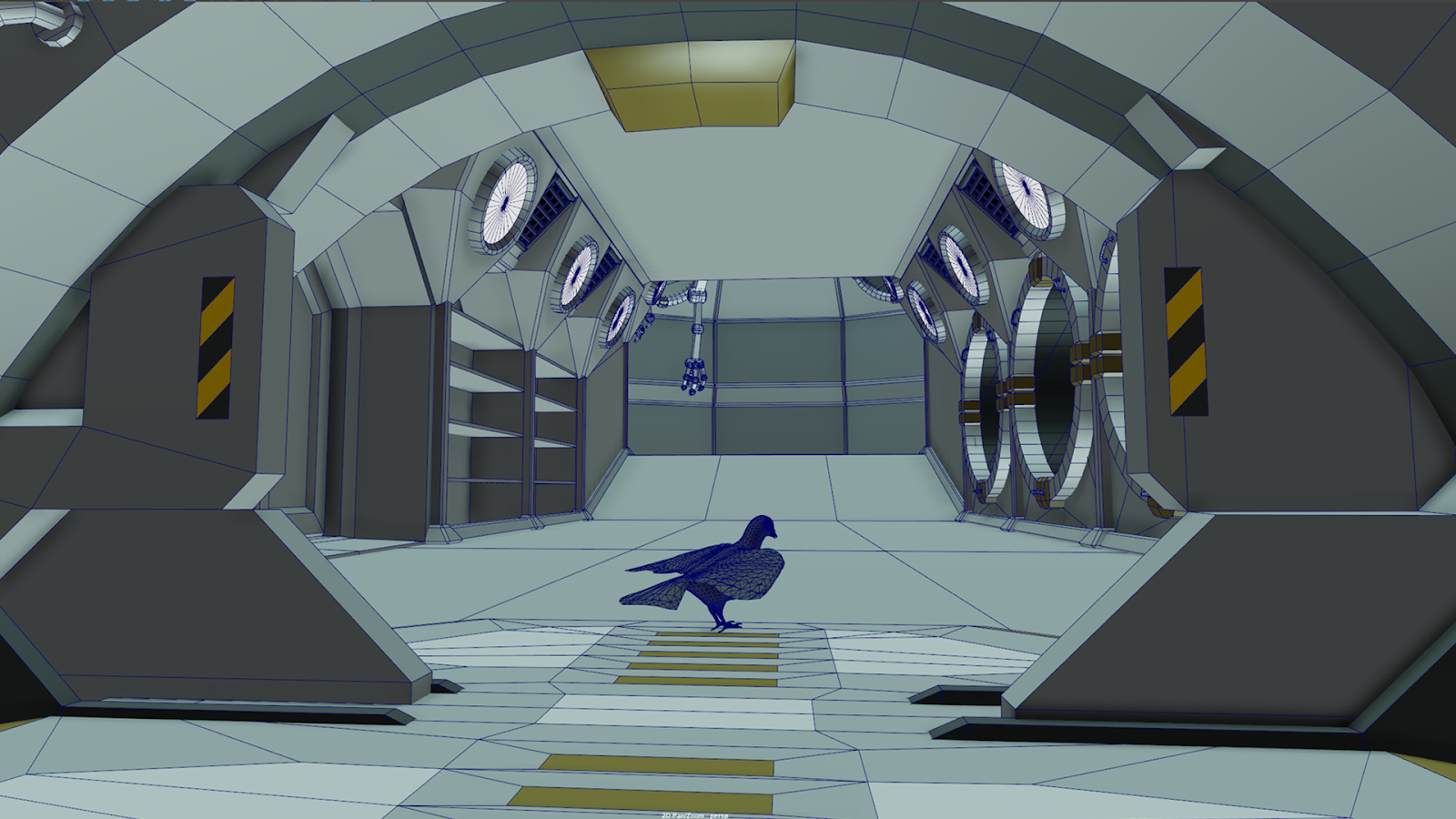
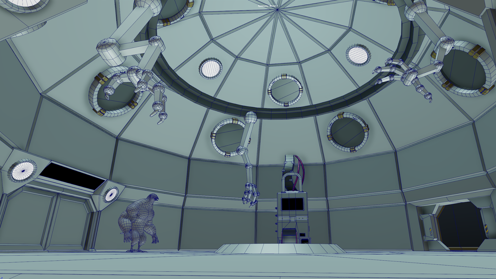
Hey folks! I’ve been cruising along in greyboxing the predefined interior spaces for Pigeon Sim. We have a lot of exciting gameplay systems coming through, and the new space station hub reflects that.
Let me introduce you to THE NEST 2.0! (aka “the space station”)
As our long-time followers know, we previously greyboxed a location known as “The Nest”. This monstrosity in the sky was destined to be the main game world hub. However, after further prototyping and playtesting, it was deemed out-of-scope and conflicted with some other big plans we had in store. We may explore the concept again in the future, but in the meantime we needed a better, central hub for the game world.
Long story short: The Nest has moved to SPACE! dun-dun-dunnnn
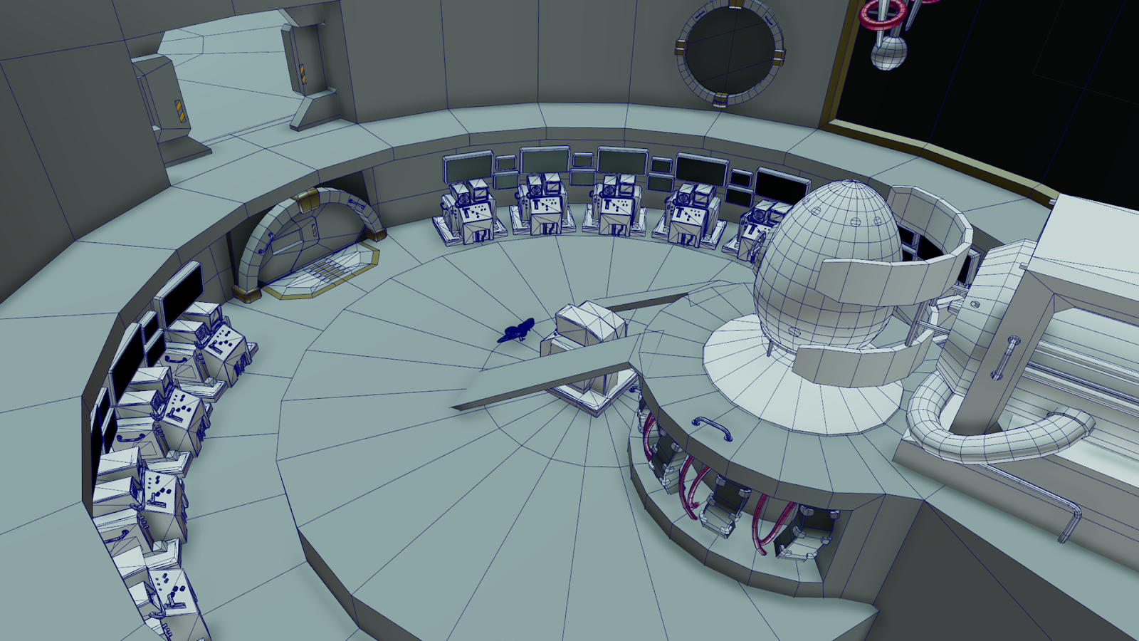
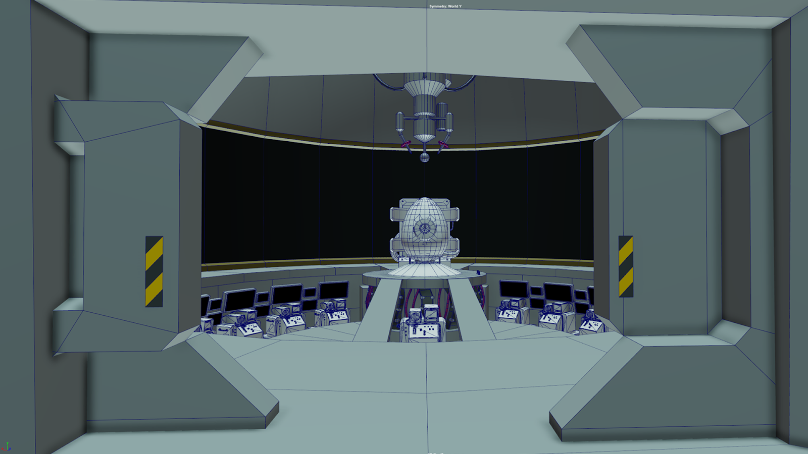
What?! Why are pigeons in space? What’s that big egg-shaped thing in the screenshot or the glowing orb behind it?
It doesn’t have any pretty art assets in it right now, and that’s all part of the pipeline! Earlier, I used the word “greyboxing”, and that’s exactly what I’m doing. These grey boxes and cylinders represent the general layout of the station before we go in and make it pretty. This allows us to play around with how the level is laid out before we commit to adding assets to it!
The red things are notable sections of the station, stuff you as the player will be able to interact with and enjoy between big missions!
It may not look like it right now, but this will become one of the most important areas of the game!
Art Direction: Game Hub & Urban Locations
Grant Niesner
Art Direction
Since stepping into the role of Art Director here at HakJak Studios, I have had my hands full learning about all of the cool tech behind Pigeon Simulator and the amazing Art Team that is bringing beauty to its procedurally generated levels. After taking the time to become familiar with the project and current processes, I have been working hard with the team to continue developing an interesting and cohesive aesthetic across the game. Working within the constraints of such a procedurally-generated game is challenging, but fun!
Space Station / Game Hub
Using the gray box layout being developed by game designer Aubrey Rogroden, and assets already created for the existing version, I began defining the basic structure in Maya for the new and improved Space Station Hub (aka “The Nest”), that will be handed off to the Art Team for its final creation.
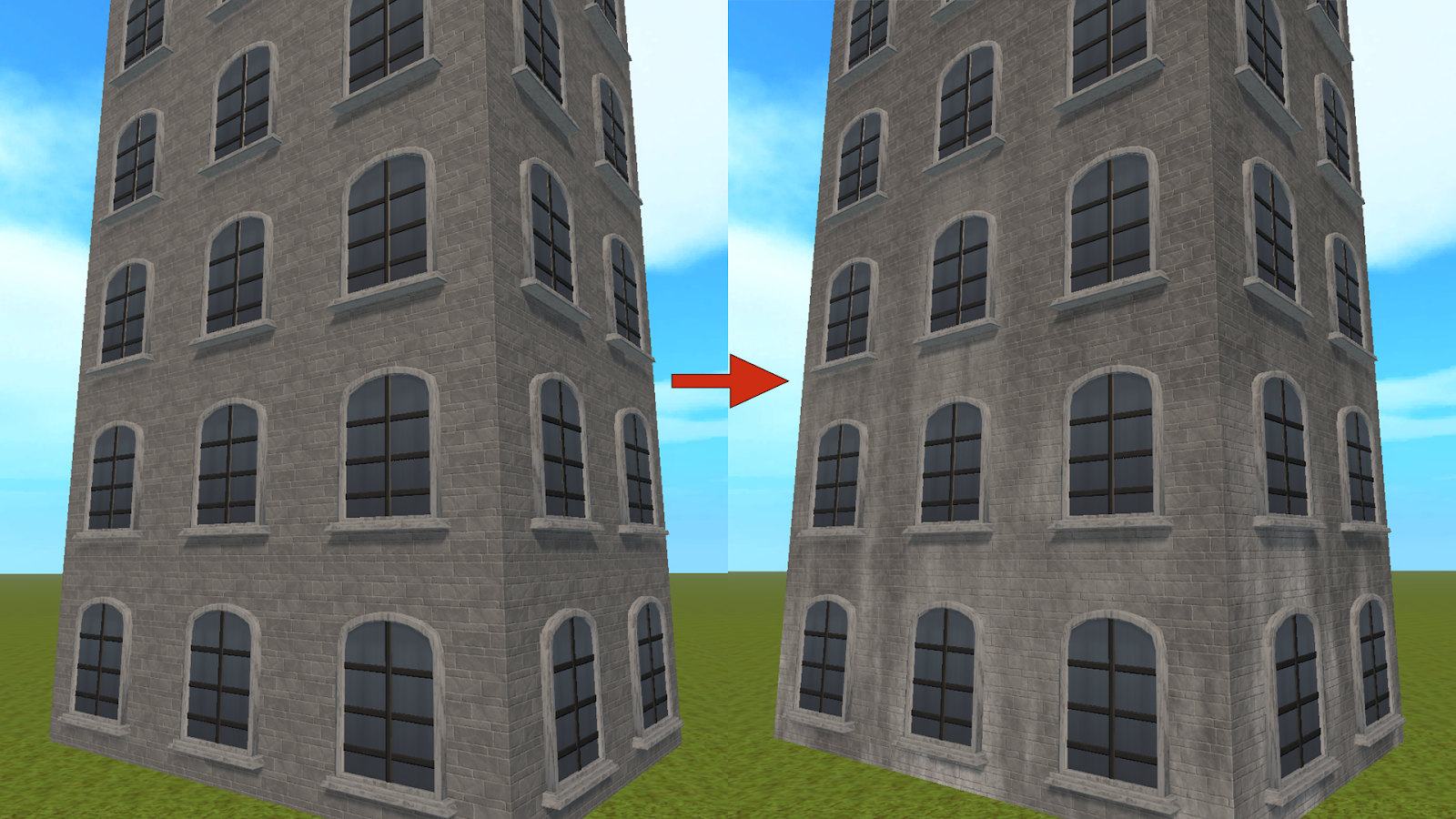
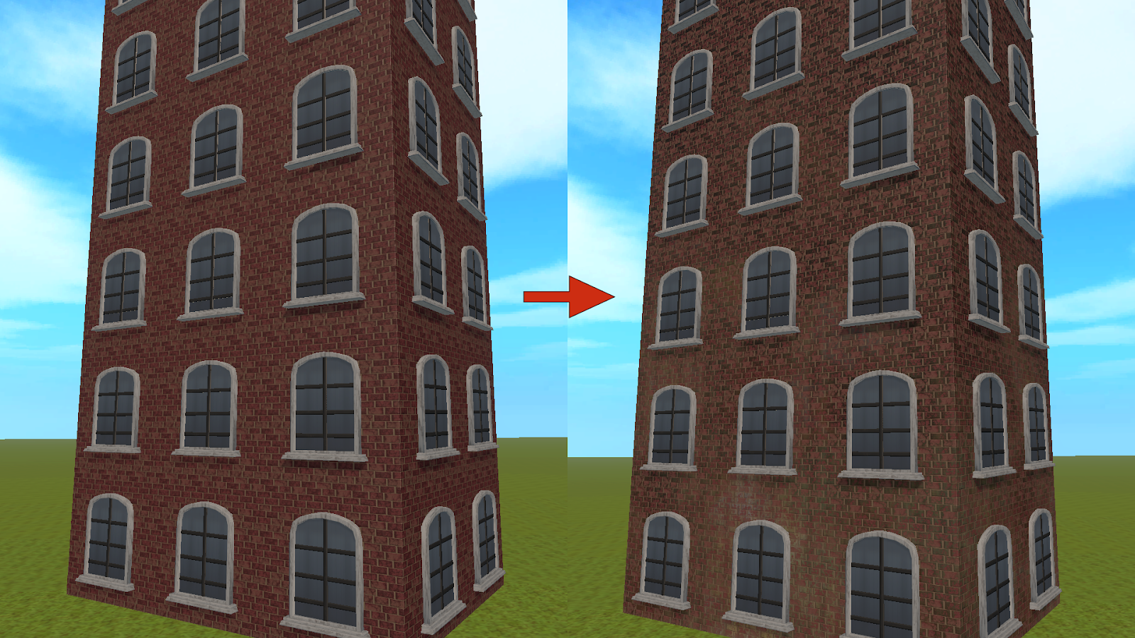
Exploring World Space Global Overlay Textures for Buildings
In an effort to break up the repeating textures necessary with procedurally generated buildings, I spent some time testing a simple world space “grunge” overlay. The trick here will be to keep the overlay subtle enough so that when any tile sections of the building are destroyed, the moving fragments (that cannot have a world space overlay applied) will not have a glaringly different appearance than the static pieces.
Quadruped Animations & Custom Editor Tools
Sophia Marcus
For this month, the art team took a look at the quadruped rigs for animals like Dogs, both big and small. We decided to create a different rig for the larger sized dogs so we don’t run into weird clipping into the future. With this decision, it allows for the different archetypes to have unique animations that better suit their stature.
Custom Editor Tools FTW!
Animation and Rigging aside, this month was a time to focus on some Python tool creation in Maya, to make the rigging and exporting workflows faster.
The first tool is the IKFK Tool which allows us to take a simple joint chain and create an IKFK switch in just a click of a button. The process of creating an IKFK switch without the tool is a generally tedious process, so we figured it was best to eliminate the tedium.
There was a need to create a quick and accessible library of existing animations without having to boot up Unity or Maya, so in order to do that, we would need to “playblast” a large variety of animations, which is immensely time consuming. To alleviate this, I created a playblast export tool that looks through the bookmark manager that specifies the ranges of each animation, and automatically playblasts each of the provided bookmarks and groups them into a user specified folder.
Vegetation
Neelam Jani
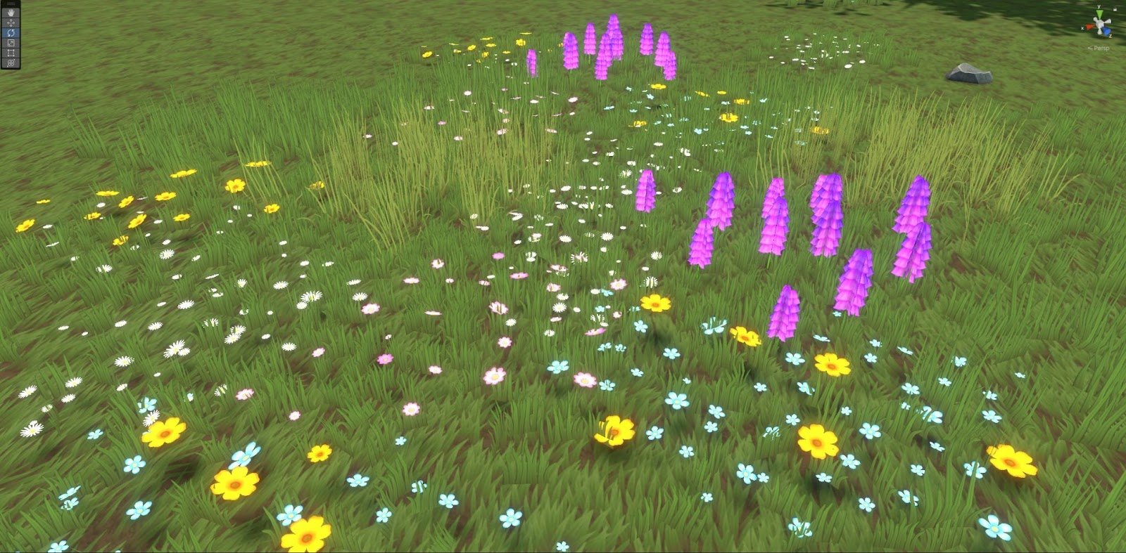
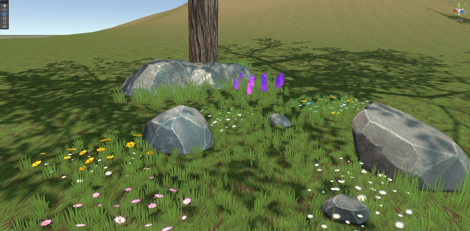
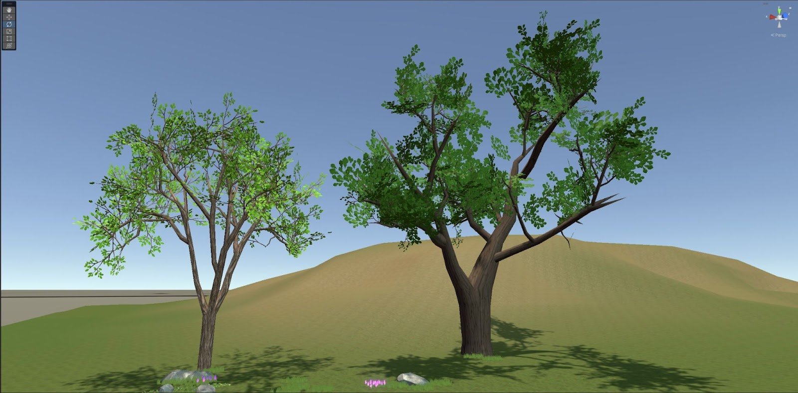
This month, I focused on a lot of vegetation clean up! I got to update our grass with fresh new textures, created a variety of flower patches, rocks and some more scalable trees.
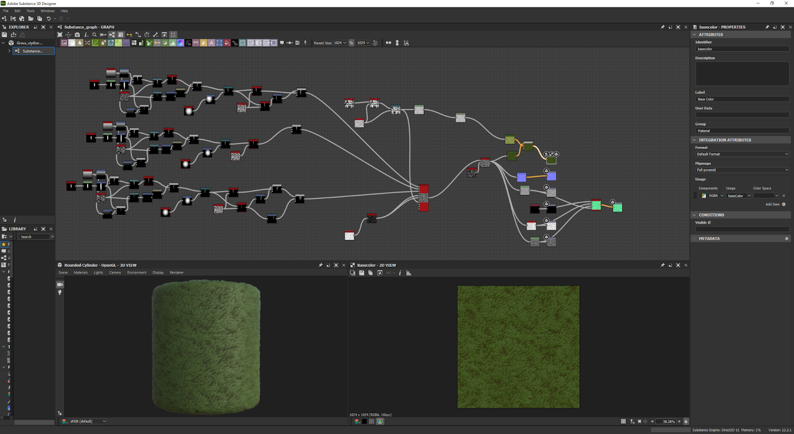
To get started, I went back into Substance Designer to review the old grass texture I created, and decided it needed some freshening up! Doing so, I created a more stylized grass that can be seen across the entire map! This is a better fit for the overall look of the game.
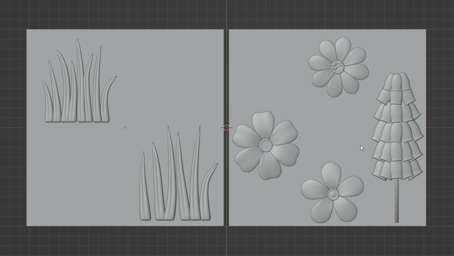
Along with the grass, I also updated the grass cards (the 3D grass elements) to make sure they matched flawlessly. In addition, flower patches were also created in the same method, having grass cards to help blend them in. To create the flower textures and make them look full of life, I baked petal models down into 2D cards and then scattered them among the grass cards.
This process was to make sure everything along the ground are all in harmony together! Be excited to smell the flowers!
I also created large Elm and Oak tree models, along with some rocks, to break up the grassy areas with more interesting details.
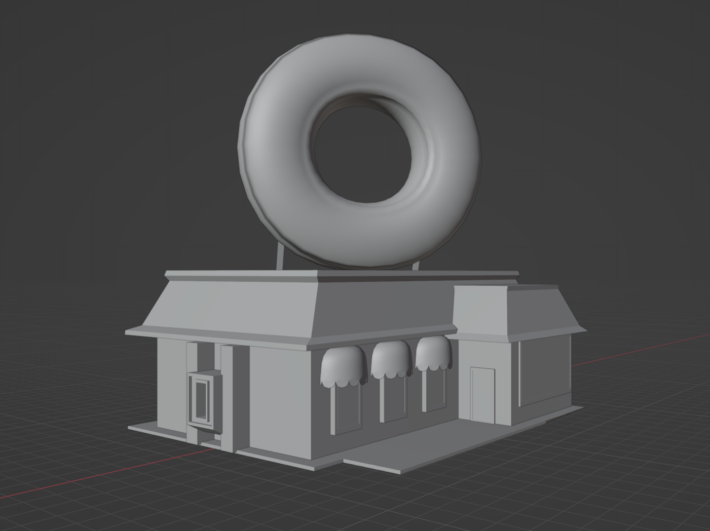
Outside of all this, I’ve also started greyboxing future fast food restaurants and more! Here’s a few mock-ups of a donut shop! Be sure to be on a look out for updates on these guys next month!
Trashy Goodness
Robert Rose
This month, one of my main goals was to prepare for dirtying up the city!
To enable that, I made a couple of advancements to power up our prop trimsheet workflow's potential. Our props use a combo of a baked normal trimsheet and a mask, which are then fed into a shader that blends together tileable textures. This is a potent mix on its own, but on larger surfaces, tiling can become apparent. So this approach was previously best used only on hard edges.
However, I made some new stylized fabric wrinkle patterns that tapered off towards the edges with Blender's cloth sim brush. I then fit them into our existing trim sheet, so props can now have wrinkled areas without needing any custom bakes or new textures- just the exact same ones we've already been using. You can see an example of that here on these fine-looking trash bags!
ahh, such beauty!
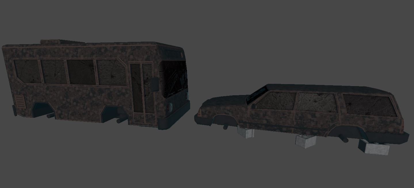
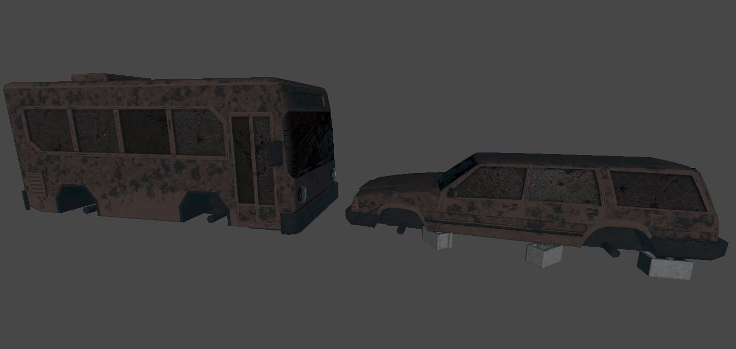
I also made some new “wear and tear masks” that allowed me to rough up some of our vehicle models, using the same trim sheet, and fight back against some of those tiling issues from before. As well as some new 'destroyed stuff' textures such as tiling broken window glass in Substance Painter.
Here’s a before and after, showing the apparent tiling and a more natural looking pattern using the new mask.
ProcGen City Updates
Junaid Nomani
Building ground levels can now be a different material than the rest of the building. Harder than it looks because this requires some GPU Instancing magic. It was worth it though, because now artists can make our buildings look more unique or themed, such as having a stonework ground floor and brickwork on the upper levels.
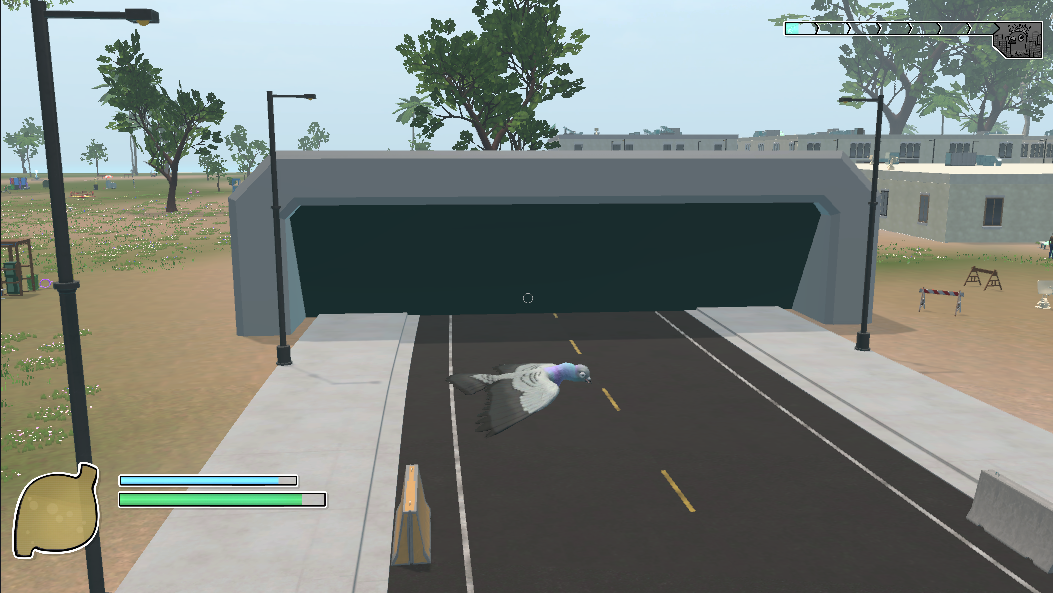
I also added “end caps” to the main roads. These spawn and de-spawn cars and pedestrians. It’s just a prototype model for now. The art team will make it look fancy in a future update.
Lore: The world of Pigeon Simulator doesn’t have many highways. Most cities are connected by teleporters or underground turbo tunnels.
Traits & Elevators
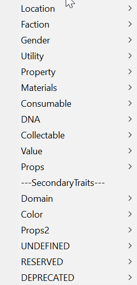
I also converted our trait system from using strings to enums so typos and the like are impossible.
This involved changing 1000+ files! But now we have these neat and tidy dropdown lists for defining assets in the game and keep everything consistent. It may not look like much, but there is great power in these traits!
I also refactored the elevator system to let you teleport to any floor and bring anything in the elevator with you. You’ll thank me later.
More Buildings, Better Plazas
William Pheloung
We've made an update to the game that increases the number of buildings spawned in a location.
In order to achieve this, we tried placing buildings further back from roads so they had more space to be generated. We encountered some issues with the sidewalks not looking right, but we were eventually able to fix them by calculating the shortest distance between the end of the road and the side of the building and placing connecting sidewalks there. The sidewalks are now straight and look more realistic.
Enjoy the new and improved cityscape!
We recently added plazas to fill in the in-game world, giving players more to explore and interact with. While implementing this feature, we encountered some issues where the plazas would overlap with each other and spawn over roads and buildings. We were able to fix these issues by reworking the procedural generation systems and how we tested for collisions.
Now our city locations will spawn a nice mix of buildings and plazas of various sizes, and make best use of the space available.
We hope you will enjoy the new plazas and the enhanced gameplay they bring.
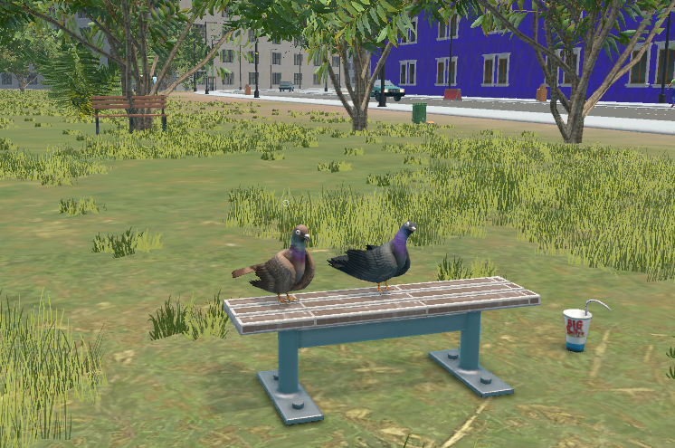
Two pigeons just hanging out? Or making plans for world domination?
Enemy Evasion
William Pheloung
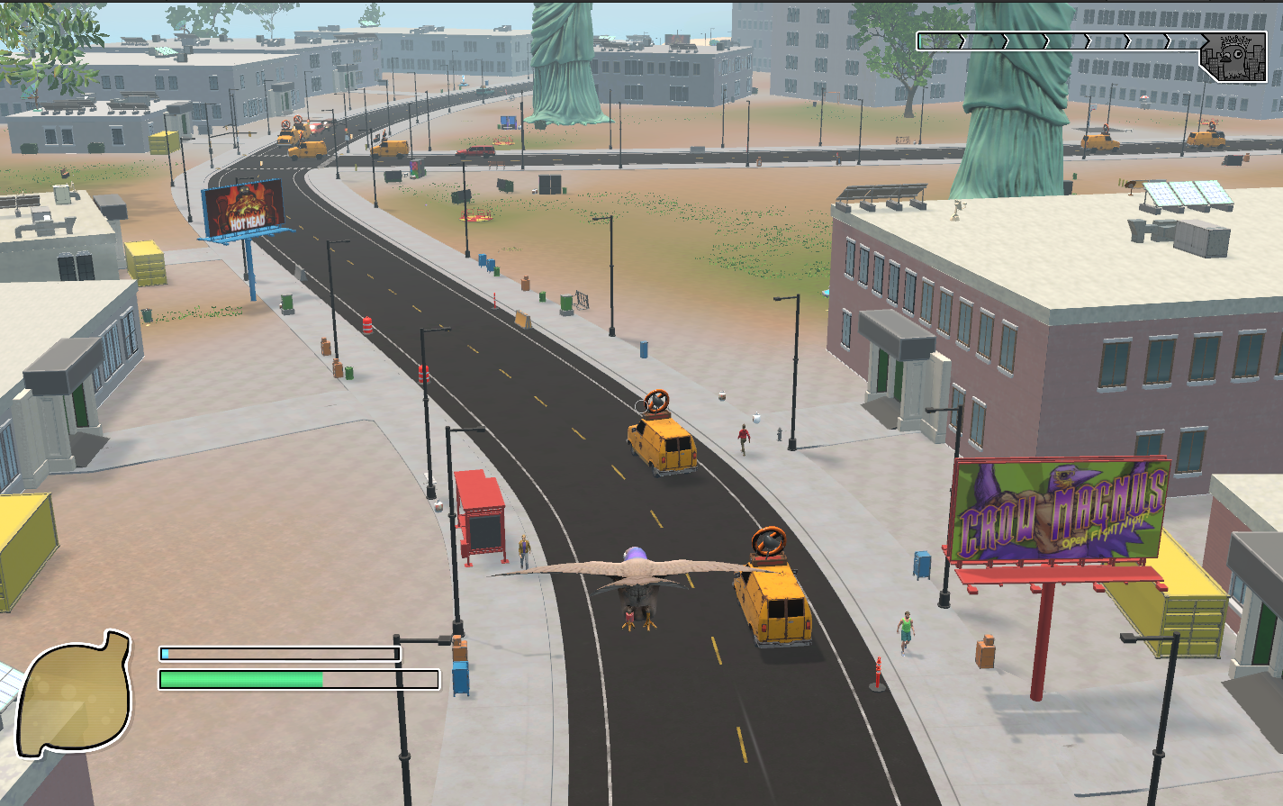
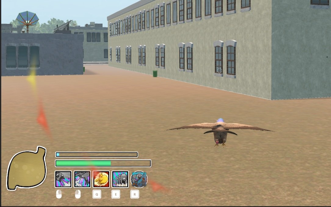
I've been working on updating the aggro system in Pigeon Simulator. Our goal is to make the gameplay more engaging and give players more reasons to use the environment to their advantage. We also want to provide clear visual and audio cues to players when they are being actively targeted by enemies.
One of the main changes we've made is switching the aggro system to be based on line of sight. This means that if no enemies have line of sight to the player for more than five seconds (adjustable), all enemies will stop pursuing the player.
A good way to lose that pigeon patrol aggro is by hiding under a desk inside a nearby office building. We've also added indicators to show the enemies who are seeking the player as well as those that can see the player.
We iterated on the aggro indicators making them smaller and more clear. At first, we started with large indicators that took up too much screen space. Eventually iterating to smaller ones with arrows for when they are offscreen.
We are testing these updates and will make any necessary adjustments to ensure that the gameplay is enjoyable and engaging for our players.
As always, we welcome your feedback and suggestions.
Prototyping UI elements to show enemy NPC locations and give the player better situational awareness. As it turns out, pigeons have a lot of enemies!
Phew, that’s a lot!
Yet that’s just the highlights from January. We’ve got gobs of goodness in store for you in the full game, and lots more to share along the way. Follow us on our socials to see more, and if you haven’t already Wishlist on Steam so you can live out all your pigeon fantasies in Early Access!
Can’t wait that long? Join our “secret” Discord server early and be among the first to have a chance to help us playtest the game! More on that soooon!

