Pigeon Simulator DevLog February 2023
Pigeons in space, Juggernauts, emotional NPCs, Crow Magnus merch, a mysterious warehouse, new vehicles, new quest types, hover mode, impact audio, menu madness, and prepping for playtesters!
It seems I have underestimated the team’s enthusiasm for DevLogs!
Going forward, I’ll be giving the team direct access to write and post updates throughout the month. This will put a better spotlight on each person’s individual contributions, as well as making it easier for you, dear reader, to stay up-to-date on Pigeon Simulator goodness.
During the first week of each month, I’ll recap the highlights with a TLDR version for you to enjoy!
— Jed “HakJak” Steen
I AM THE JUGGERNAUT!
Sophia Marcus
The first thing I focused on this month was the rig creation and animations of the Juggernaut character.
The approach to animation in this case was to treat both the large mechanical rocket and the Pigeon Patrol person’s legs as two separate entities. When the rocket is off, the legs have to lug around this large hunk of inactive machinery, versus when the rockets are going, the legs struggle to keep up with the speed and, at times, have to surrender to it like the rocket pods have a mind of their own.
Getting Emotional
Sophia Marcus
We decided to take another look at how we handle emotions in our game in order to infuse the characters with a bit more life.
We’ve devised a list of 15 essential animations that most of our key characters need to communicate properly. Things like happy, sad, angry, interacting, prideful, etc. animations. These animations need to have two variants, a one shot animation that shows a burst of the needed emotion/action and then the idle version of it that can be looped without it being jarring. The one shot animation in this case flows into the idle so we can choose to play the whole thing together or just use the oneshot or the idle versions on their own.
We also came up with a list of 15 extra animations that give our character just a little bit more juice and personality. These animations can include things like patting themselves down to check for keys, working out, doing a flip, etc.
The focus at the moment is to nail down the essential animation sets for our human archetypes and, of course, the pigeons.
Here are a few of those emotion animations on our standard human character….
Crow Magnus Brings Toys to Town
Emma Lowry
This month, we added some unique props and new NPCs!
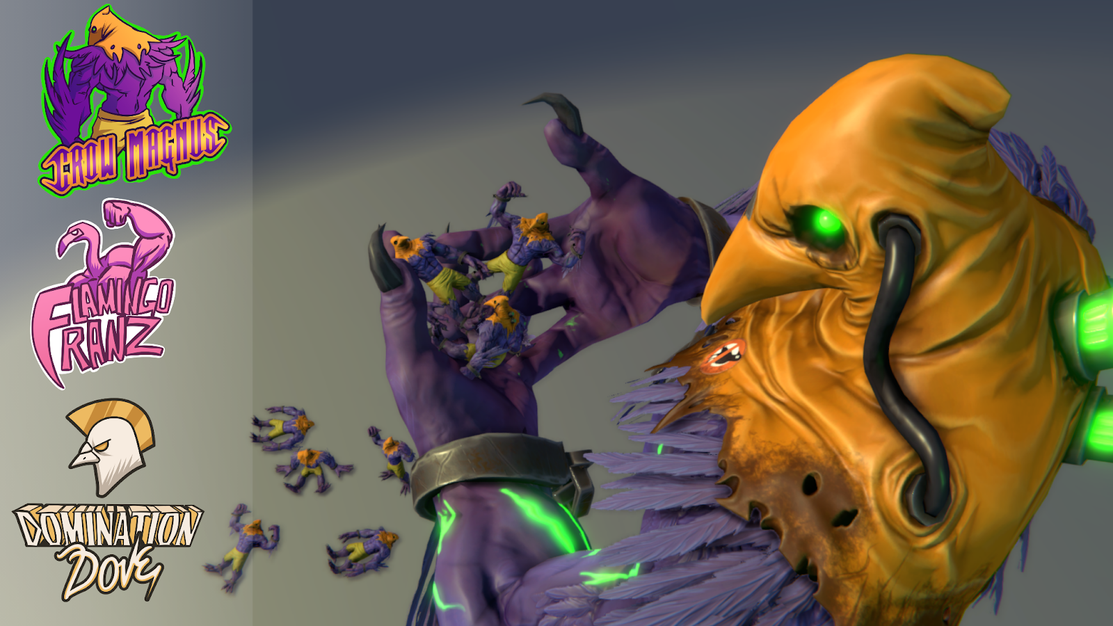
I started out with some Crow Magnus action figures for use in one of our story arcs. For each, I posed an extra-low-resolution version of our Crow Magnus model and modified his existing textures a tad. We also wanted some fun logos and t-shirt designs for the fans of our other wrestler characters. I drew those up and then created some variant materials for our T-Shirt NPCs that utilize them.
Now Domination Dove, Flamingo Franz, and Crow Magnus will have lots of merched-up fans cheering them on!
I also chipped away at some Pigeon Patrol-related props and other special items, like folded up PP suits, ID badges, a PP Radio, and a key to our elevator. We decided to take the traditional “baked” route for these props rather than utilize the trim sheet method. This gave us a chance to get some item-specific sculpted details in.
Pigeon Patrol gear and few copies of “The Daily Coo”
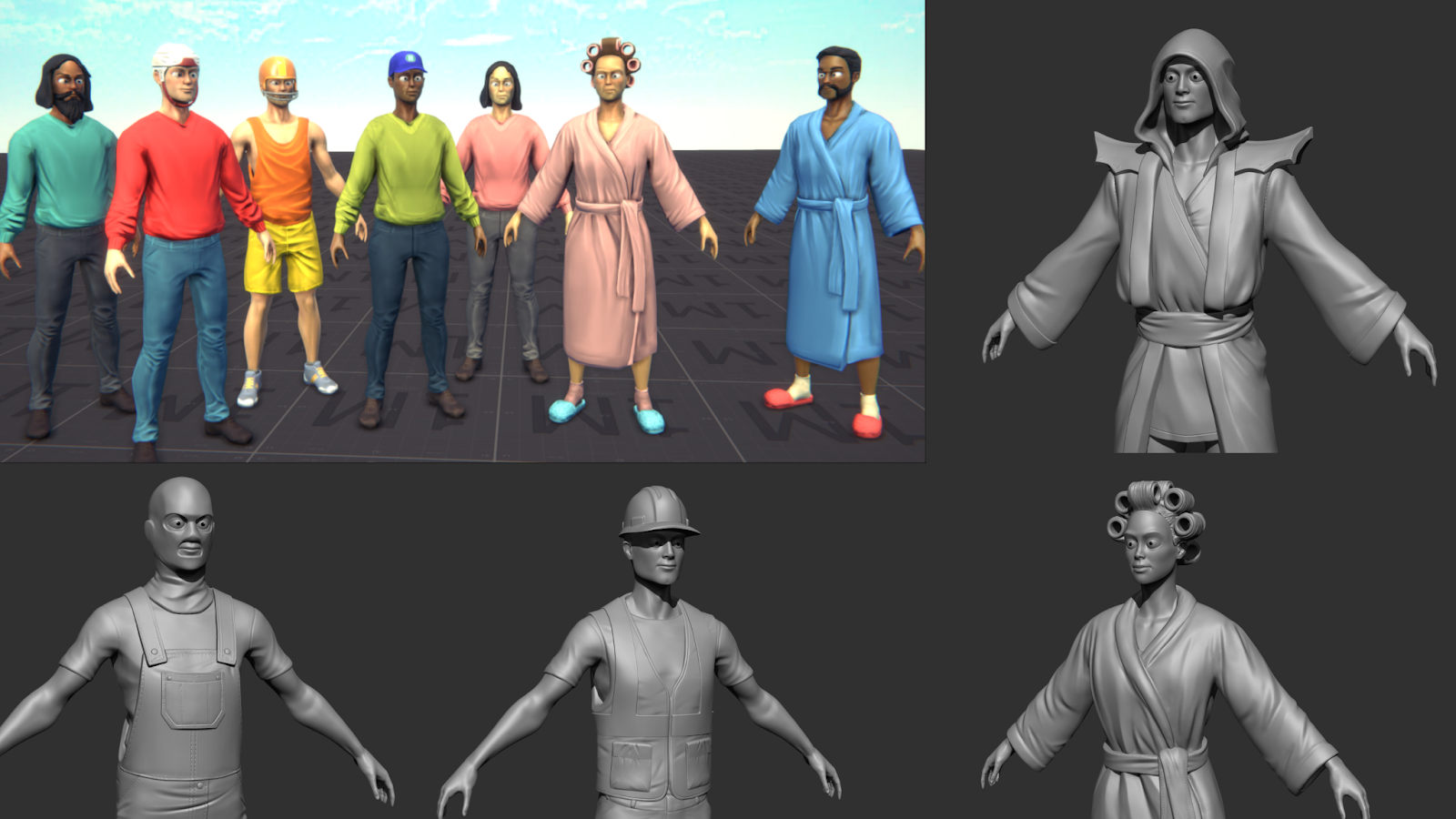
Lastly, I returned to building out our library of civilian characters. We wanted to break things up and add to the chaos of our city by making some goofier “out-of-place” folks. This includes discombobulated, bathrobe-clad pedestrians, cultists, and a hockey player who just can’t find his ice rink. Some of these new civilians were built out from existing assets that didn’t make it into the previous crowd pass, and some required new sculpts and models. We hope to continue expanding this cast of characters to add more life and silliness to our crowds!
Mixing and matching to create fun new pedestrians. Work smarter, not harder, am I right?
Art Direction: Hub, Terrain, Warehouse
Grant Niesner
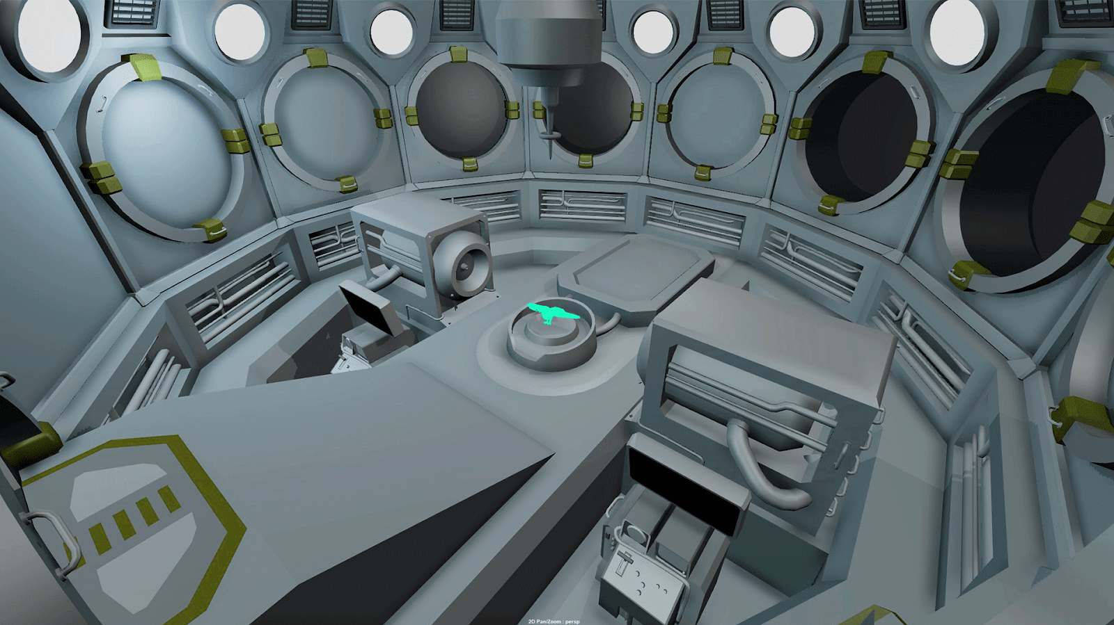
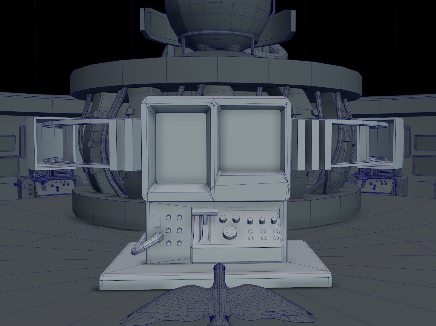
This month, in addition to working on refining our art production and implementation process between the development and art teams, I continued fleshing out concept models for the space station player hub, "the nest". This included a 3D version of the Flux Warbler machine, based on the 2D menu design by Dylan Valev and illustrated by Emma Lowry. Robert Rose is taking those concepts to the next level with his detailed modeling, texturing and materials.
I also continued experimenting with world space overlay mapping for our procedurally generated terrain.
Before and After terrain shader updates
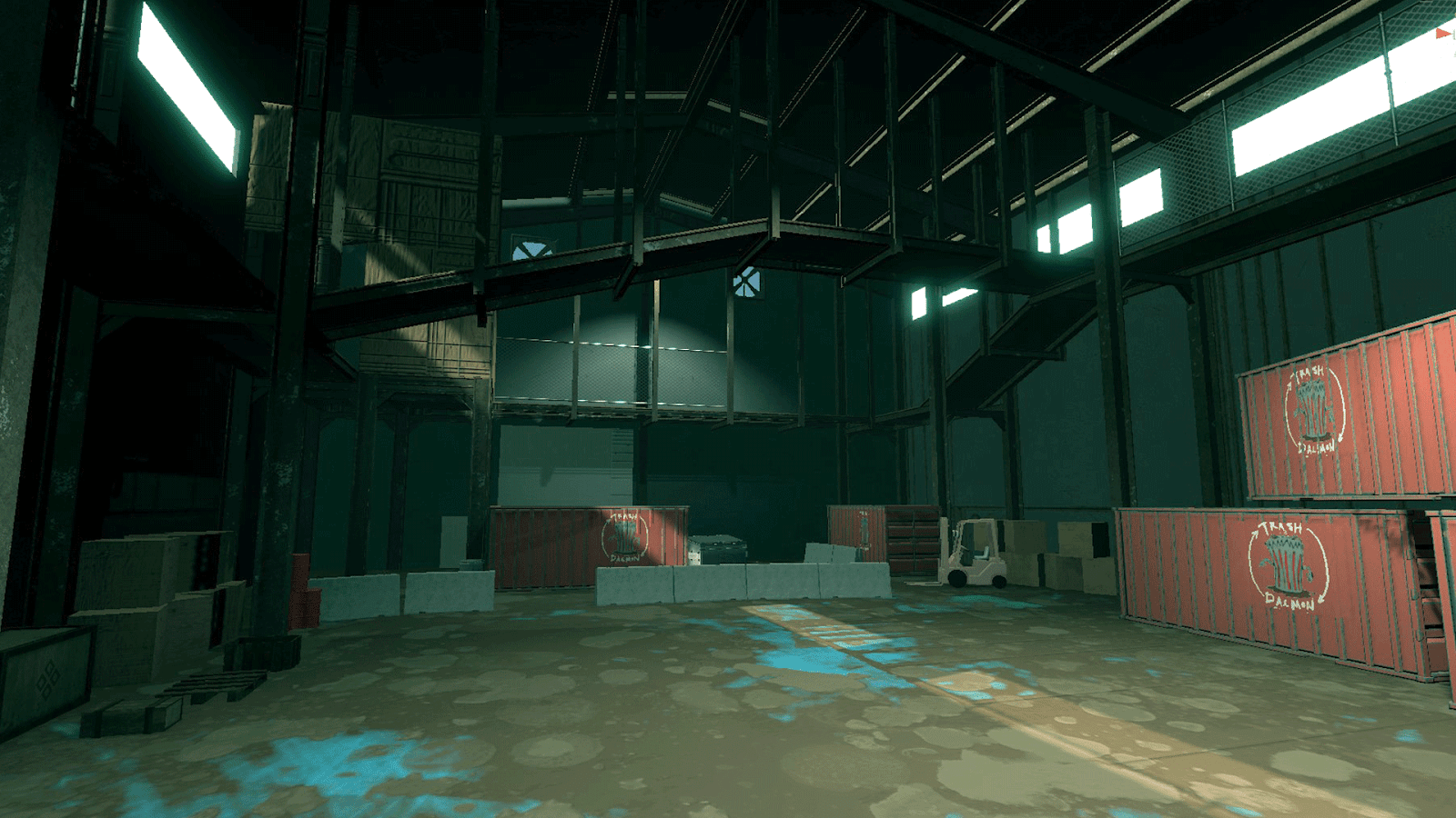
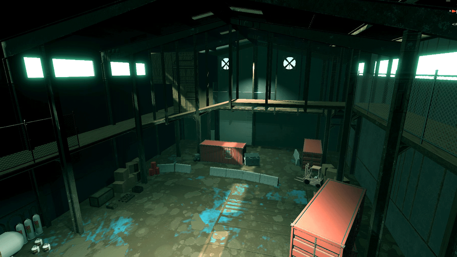
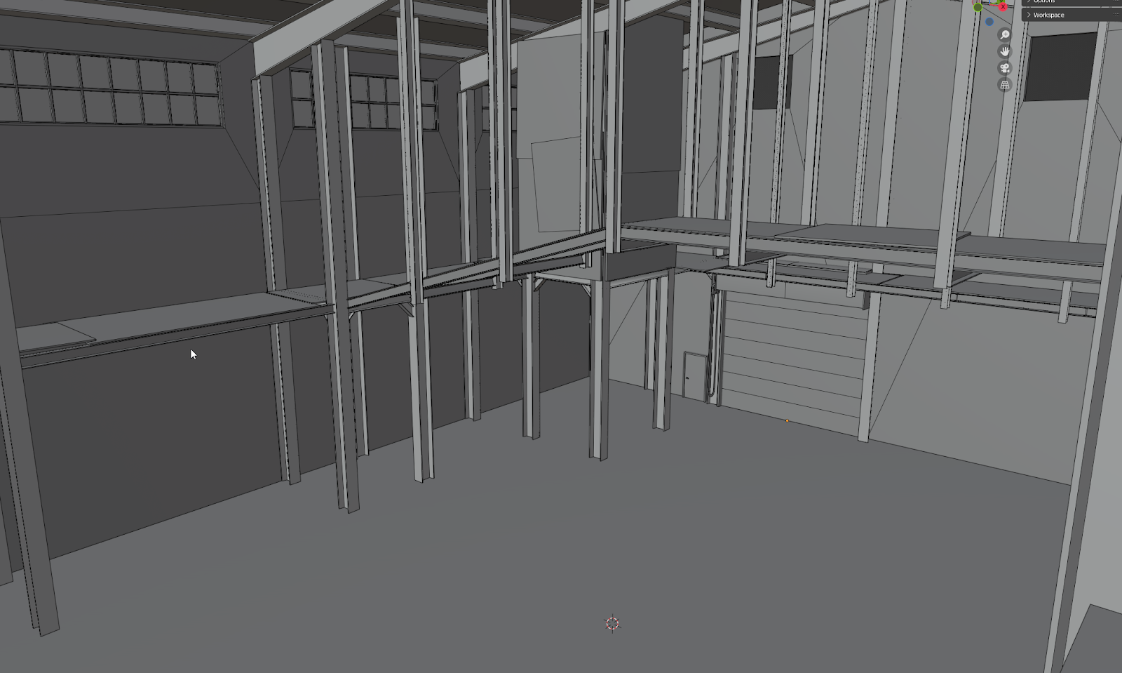
Finally, I created a detailed greybox warehouse for our intro tutorial location based on the 3d layout created by our brilliant game designer, Aubrey Rugroden. Then handed that off to Neelam Jani to do the heavy lifting and final execution.
Traffic Jams, Space Jams
Robert Rose
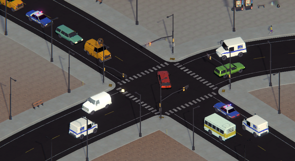
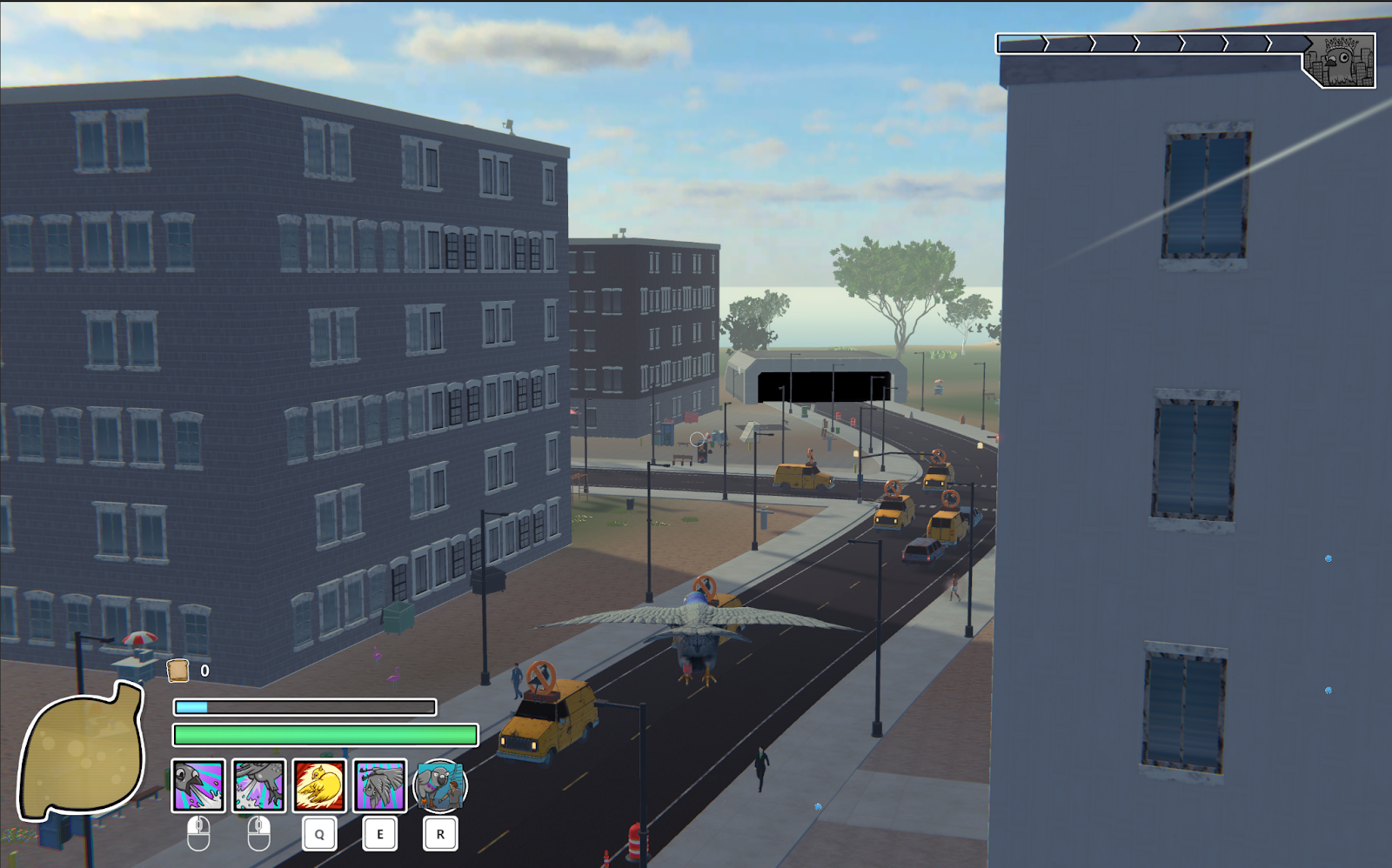
This month I implemented several of the vehicle models I’ve made in previous months so that they now spawn in our city’s traffic. There will be more to come soon, but the variation is already making it feel much more like a real city sim.
Pigeon Sim City
Introducing new vehicles to the road doesn't always go smoothly however… Just a little fender bender here and there!
The road rage is real.
Additionally, we added Access Tunnels. These underground portals connect the traffic system of various locations in the world of Pigeon Simulator. Props to Aubrey for her awesome depth shader on these!
Introducing the new “Hyper Access Tunnels: Connecting you to distant destinations in an instant!”
I also spruced up a lot of our older props, making them look nicer or fixing issues with colliders, boundinb boxes, materials, etc. I even created a new shared decal atlas template so props of any shape or size can share the same branding, stickers, and more, without extra time spent on UV adjustments, etc.
We need a surprising amount of trash, boxes and debris to represent human presence in Pigeon Simulator.
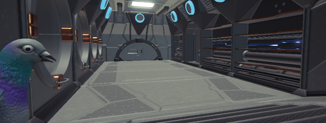
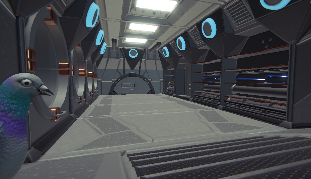
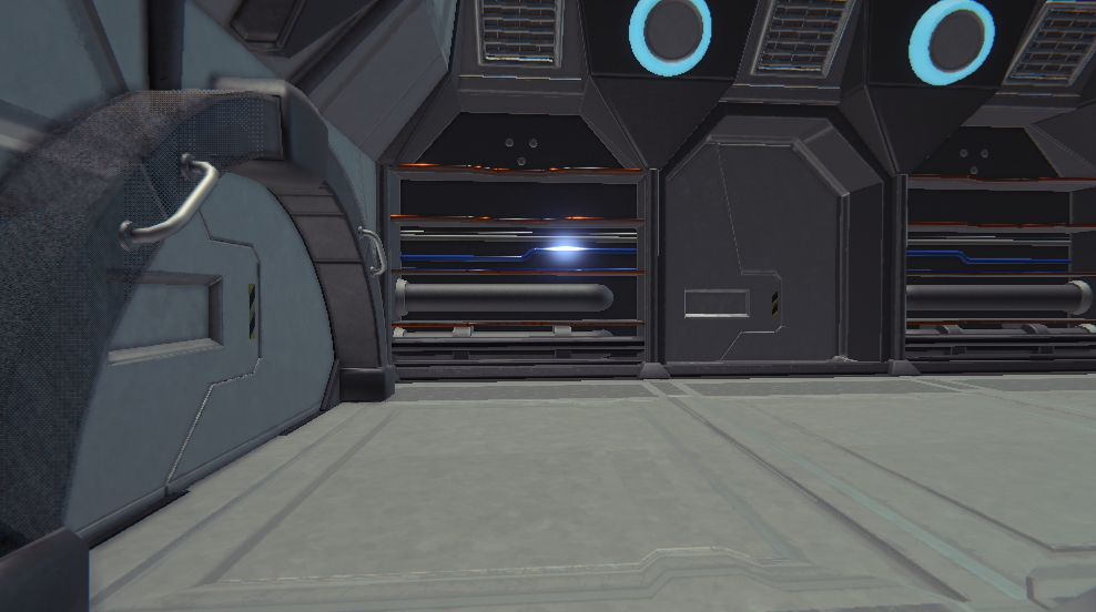
But the biggest undertaking this month has been a revamp of our hub Space Station’s interiors, first set out by Aubrey and Grant, but now with final materials and polish underway- here is a sneak preview of the swanky style (still with just default lighting- more atmosphere to come!)
Looking forward to showing what’s lurking behind some of these mysterious doors next month!
Unique Buildings
Neelam Jani
This month was mainly focused on creating some of our “unique buildings!” These are separate from the procedurally generated structures and allow us to create special architecture and interiors.
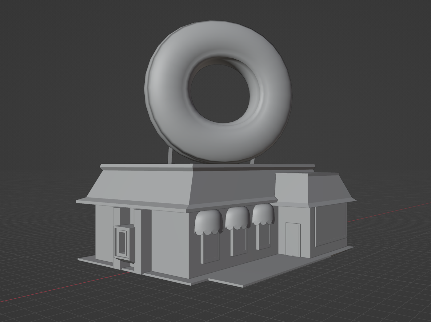
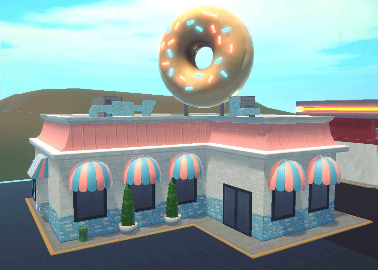
As I mentioned in my last Devlog, I started by working on our Fast Food Restaurant. It took some time to greybox, measure and model out, but overall, it was very fun to design to reuse for future restaurants!! Currently, I have it dressed up as a donut shop with a fun neon sprinkled donut that hangs around on top! The colors are also a more pastelly version of Colossal Carl’s branding, which we have theorized will be a company that not only sells gasoline, but snacks as well!
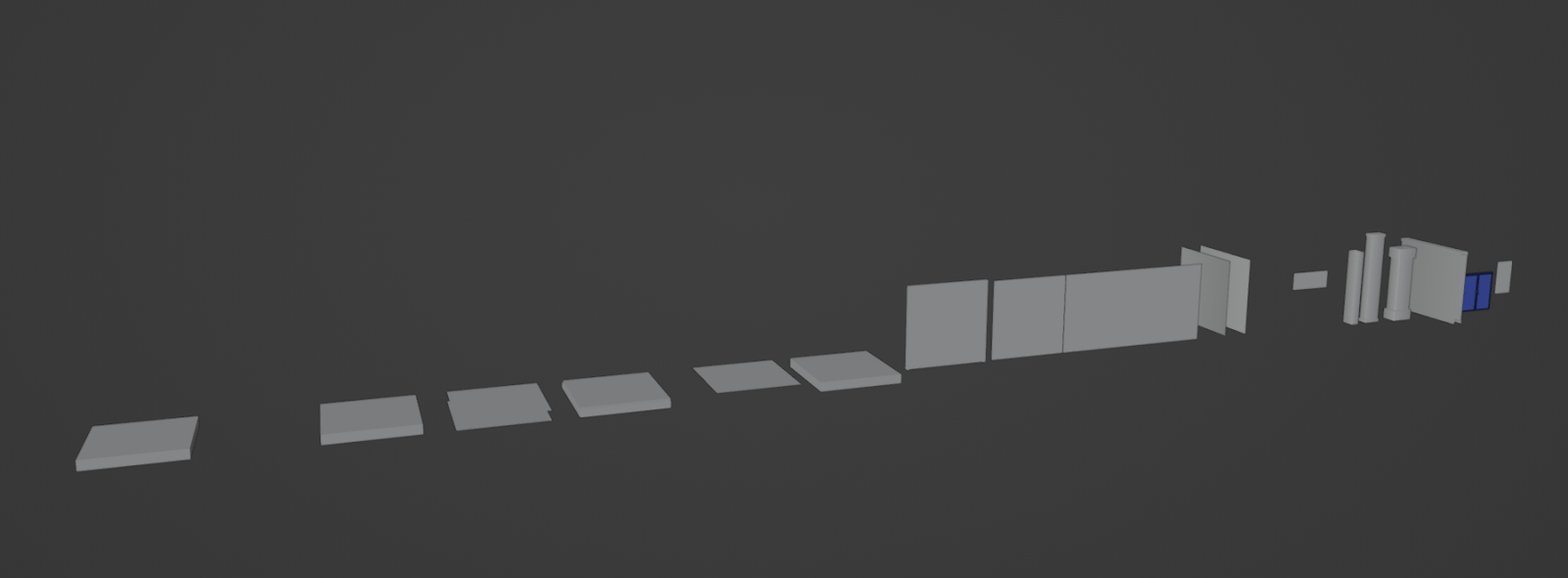
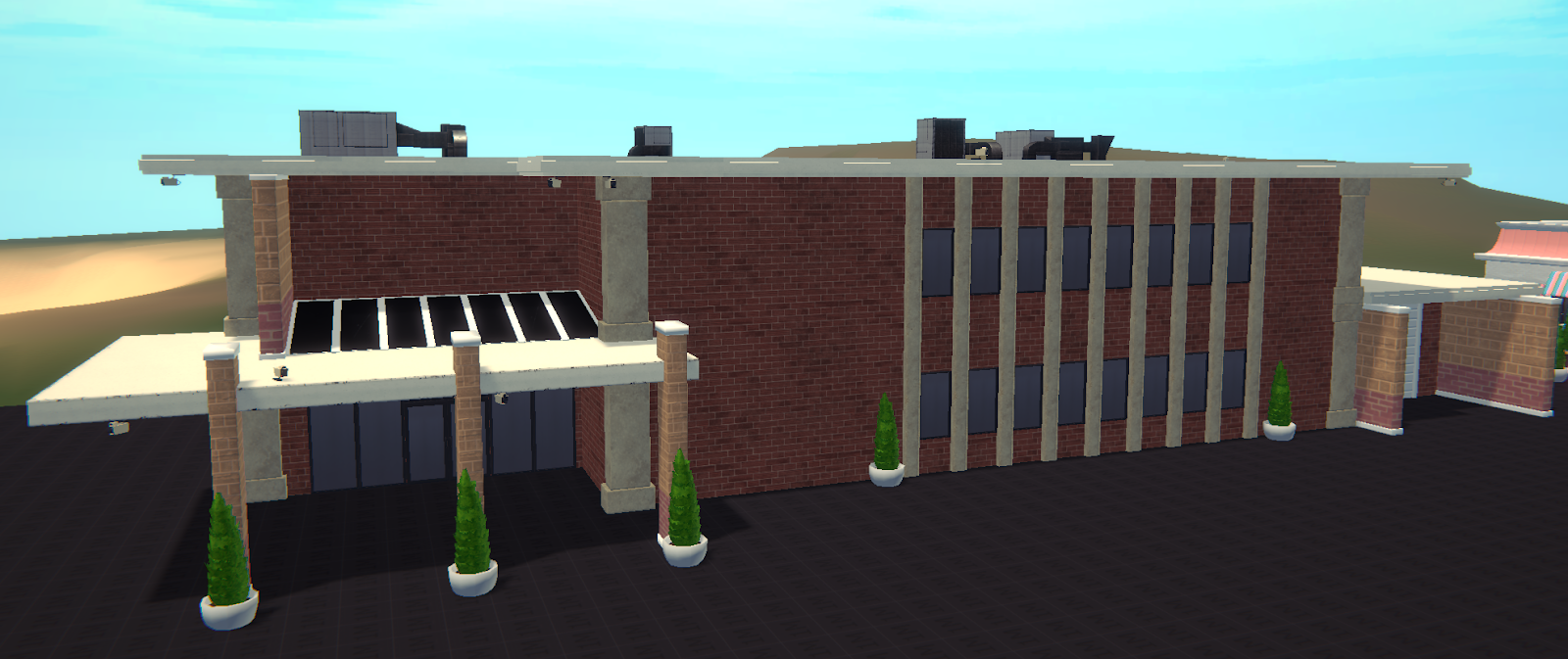
Next, I started working on the Police Station, which will also be doubling as the PP Headquarters! This was an interesting experiment we decided to do. Since our current buildings are all modularly placed with corners, walls, and windows, I decided to do something similar with the Police station that used Unique Modular Pieces that we could puzzle together and reuse for other future “governmental” styled buildings, like a museum!
They don’t look that great here since theyre mainly just cubes and square planes, but I assure you they have came in super useful with creating quick buildings!
It may not look like much right now, but these meshes magically create a bunch of different buildings—like the police station below!
After creating these pieces, I made sure to check the UVs, especially for the building walls as I needed them to have the textures be seamless as they connected together I went ahead and started putting them together in Unity, however we decided itd be best to put the buildings together outside of the engine and inside our 3D programs as it would cause too many draw calls and there was no efficient/easy way for us to merge all the pieces together to create 1 mesh. After all that, got it in engine and placed materials, and now we have a Police Station in all its glory! It’s still gonna need a few more tweaks and details added, but overall it was a fun learning experience, and will definitely come in handy when we build out future buildings using this method. It’s good I’m building a library of modular unique parts now so we can build more fun and interesting places in the future!
Up next, I got to take on the task of creating our fun new tutorial space, The Warehouse!
I started out with taking the greybox design from Aubrey and Grant, and organizing all the pieces by groups!
We had all the interior pieces, which included metal beams, roof beams, plywood, and other small nitty gritty details. After cleaning them up, I went into UV mapping and making sure all the texel density looked solid!
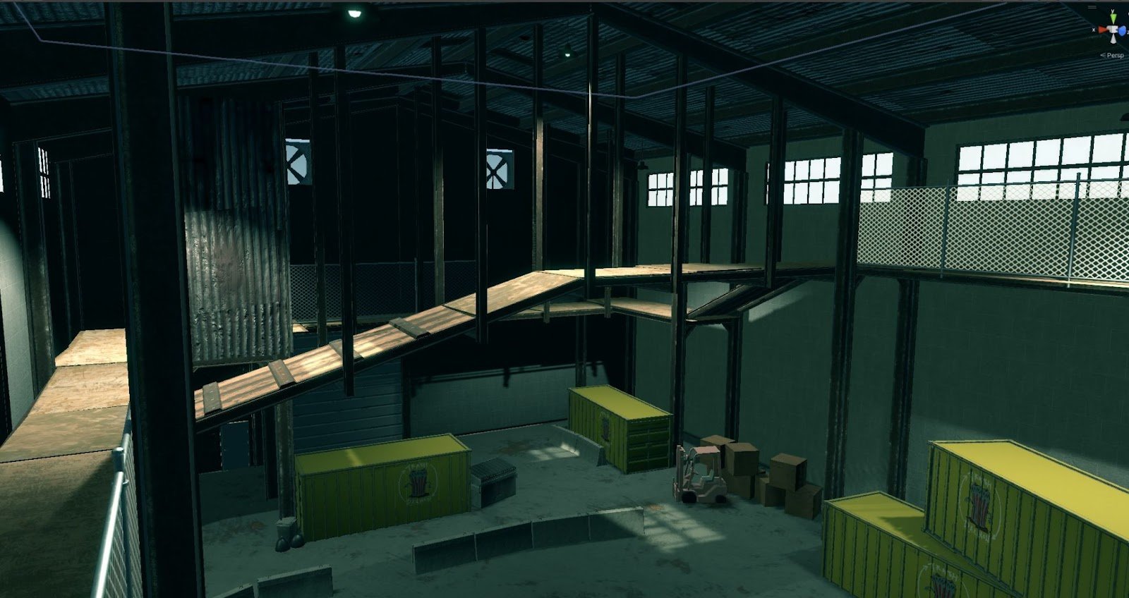
After all that, it was time to do some testing. Throwing it into Unity, I did a series of material tests and went back and forth between Blender, Substance Designer and Unity to make sure the materials I created and the trim sheets all looked great! Then we imported it into a cool scene with cool lights and post-processing effects!
Special thanks to Aubrey and Grant for the greybox work on this. They were a huge help to get this building up on its…..feet..? …..Foundation???
Pretty coo’ right? This helped me move forward when I was creating some of the warehouse materials!
We got our dirty windows, corrugated metal for walls and roofing, cinderblocks, chains, etc! Everything to make the warehouse look gross, used, and very lived in! I’ll be continuing to flesh out the warehouse this coming month, and with some more exciting props to start filling out the space with fun little details, look out for those soon!
UI Updates
Aubrey Rugroden
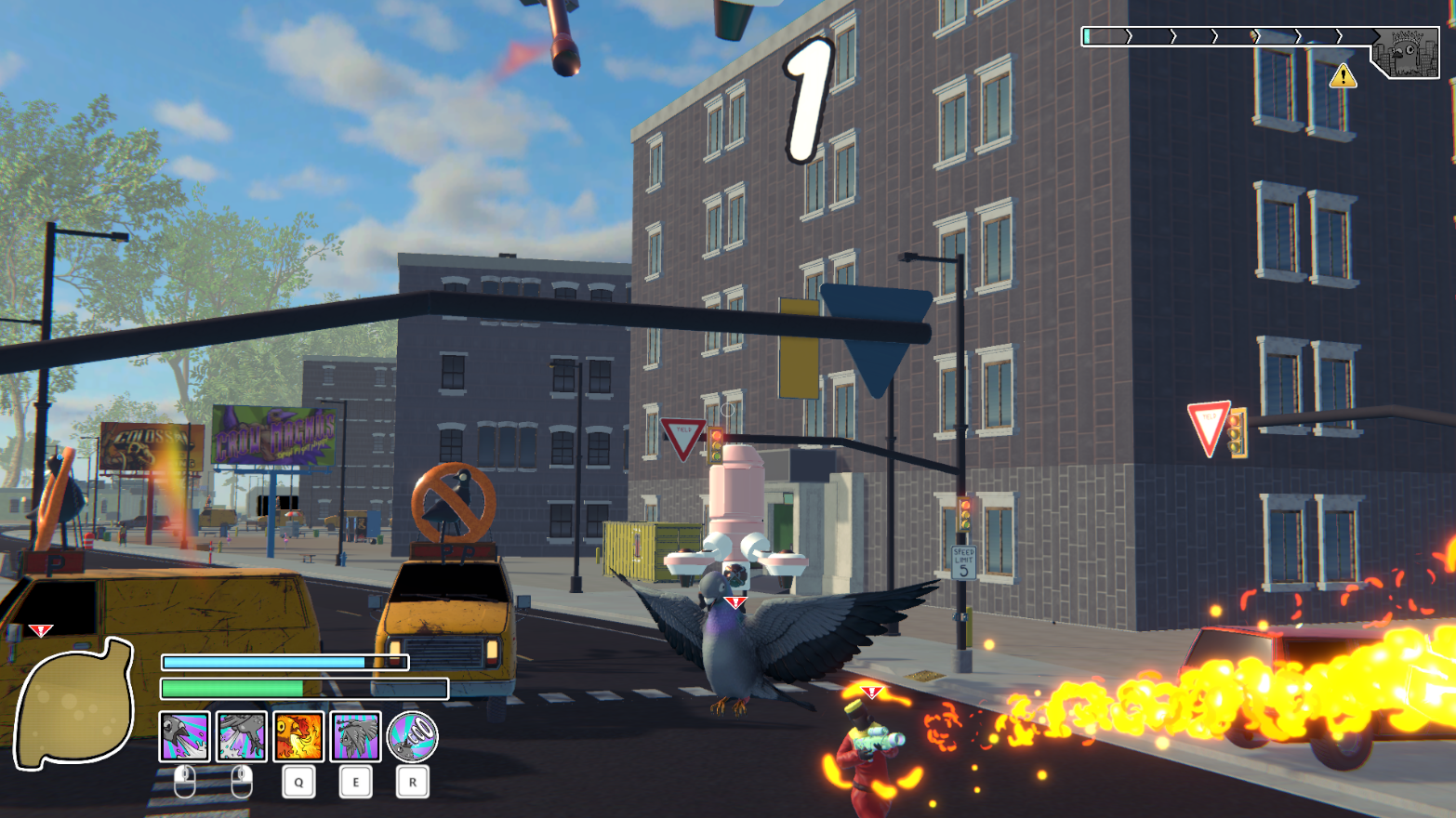
Aubrey again! This month, I did a whole lotta work on UI elements. I’m further refining shape languages and overall look and feel! Take a look at the most recent HUD iteration (click to view larger images):
HUD is super important for any game, since it’s the interface to show what’s happening under the hood that normal gameplay might not necessarily show. Health, quest info, threat level, all that good stuff! I’m super excited to keep working on this HUD to make it as helpful as possible!
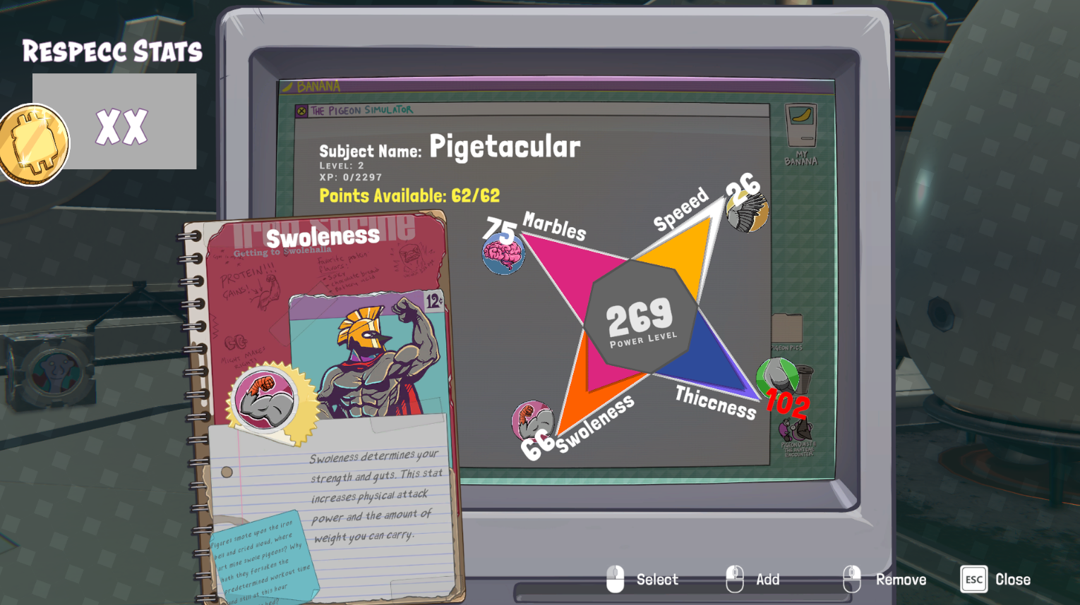
Which Stats will you invest the most points in?
I’ve also been doing a lot of work on the layout of menus in the game! With Dylan’s help on the implementation side (I’m a designer, so code work is a little beyond my realm), we’re getting the stats menu looking real schnazzy! Great stuff is in store, and it’s exciting to see the solutions we come up with to make the more tedious stuff as fun as possible!
Menu Madness
Dylan Valev
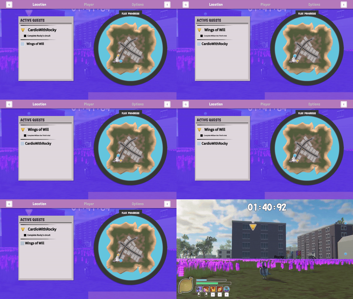
This month we further refined the design direction of our HUD and menus. Most notably, the brand-new Location Menu and revised DNA Menu! The Location screen allows the player to locate both active and available quests on a minimap and swap their current quest on the fly.
The new DNA screen allows users to more easily view all of the abilities they have discovered, unlocked, or assigned to their current build. We have a lot of power-ups in this game, so having a screen that allowed them to be viewed easily is very important.
Cutscene Cameras Version 2.0
Madison Belka
During the last month, I took time to update our cutscene camera system. Rather than having one camera for each shot that we want to display in a cutscene, there are now multiple cameras for any given shot we desire. We can then use points of interest, the speaker, and the player, as heuristics to select the best possible shot.
With this update, going forward it will also be easier to add features such as camera effects and transitions which will add more dynamism to dialogue and conversations.
Fixing In-Game Flowers
William Pheloung
We’ve been reworking the vegetation system in Pigeon Simulator to make the vegetation look better and more immersive.
In order to get started working on this system I needed to make sure that we were generating the same configuration of flowers every time the map was generated. I had to make sure we used seeded randomness in order to accomplish this.
Previously, the flowers looked very uniform and artificial. To solve this, I decided to add some randomness to the flower spawning process by using Perlin noise. Perlin noise is a type of noise that is commonly used in computer graphics to create natural-looking patterns and textures. By applying Perlin noise to the flower positions, I was able to create a more organic and natural-looking distribution of flowers on the grid.
The next step was to categorize the flowers into two groups: stemmed and stemless. Stemmed flowers were created with stem mesh that was attached to the flower model, while stemless flowers were spawned with grass underneath them to make them look more natural. This categorization allowed for greater variety in the types of flowers that could be spawned and helped to make the overall scene look more diverse and interesting.
Fixing Indicator Systems
William Pheloung
I first fixed an issue where indicators would not disappear after pigeon vision is done, and I also resolved an issue where story mods would send multiple indicator requests at city startup, with only one showing up until pigeon vision is used. I made sure that all indicators were disabled on start, but would become enabled when the player approaches them or uses pigeon vision.
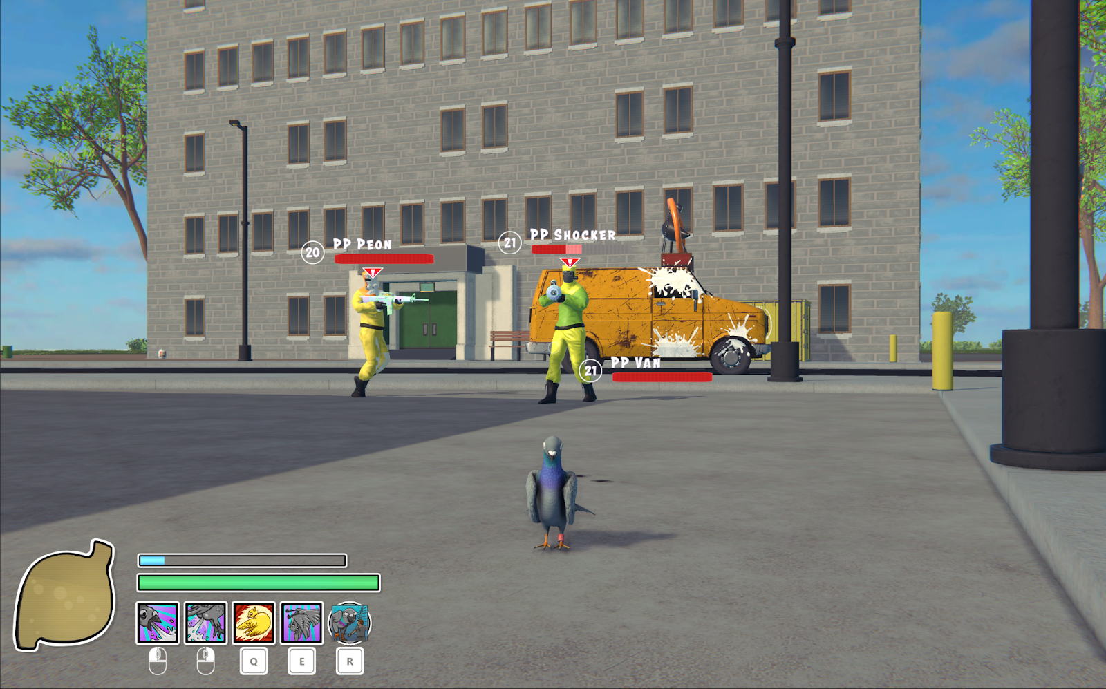
Next, I fixed the layout for the health bar and aggro indicators so that they did not overlap, which was causing confusion for players. I also reconciled all the different indicators that can appear on an NPC, ensuring that no two indicators would appear at the same spot and overlap.
Finally, I added the option for certain indicators to disappear after a given amount of time and for other indicators to grow as the player approaches them.
Swift poopy justice! Thanks to properly functioning pigeon UI.
Plaza Performance Optimizations
William Pheloung
Today we optimized unique buildings and plazas in the city thereby ensuring that we could add more of them to the game without causing any performance issues.
To optimize plazas, we added a listener that checks for the player's current distance from the building. When the player is far away, we sleep all the elements that are now out of range of the player. This disables the physics of these elements as well as gameplay logic and rendering, which helps reduce the number of objects that need to be rendered or updated, further improving performance.
We also provided the option for landmark objects to never be slept, allowing players to see them even when they are far away. This helps maintain the immersion and visual interest of the game while also helping players navigate the city by remembering where key objects are.
After implementing this feature, we thoroughly tested the game's performance to ensure that it worked as intended. We were pleased to see that the game was faster and smoother, allowing us to add more unique buildings and plazas to the game without worrying about performance issues.
This city keeps growing…
The Mysterious Floating Windows Bug
William Pheloung
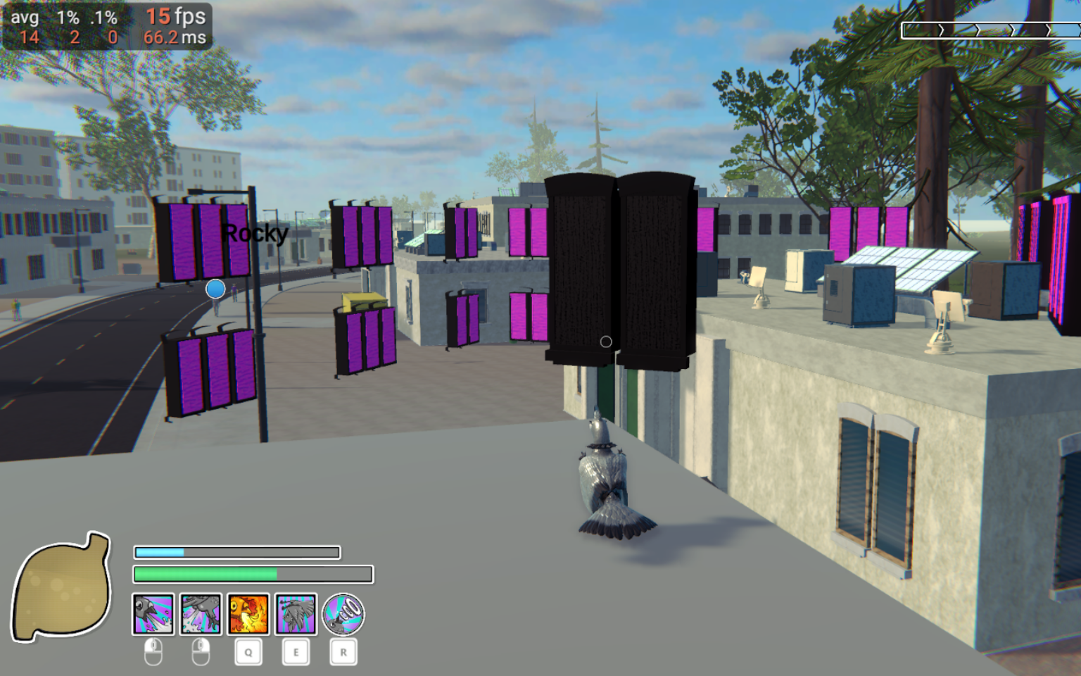
We fixed a fairly complicated bug where random windows were appearing floating in the world. This bug had persisted in the game for a while so we were very glad to be rid of it.
One of the challenges we faced during this fix was that the bug did not show up very often, and when it did, it was not consistent. This meant that in trying to generate the same map two times, the bug may only show up one time, making it difficult to reproduce and fix.
To overcome this challenge, we had to fix the seeded random procedural generation system so that the bug would reproduce consistently. The seeded randomness was getting disrupted by multiple threads that were trying to generate things randomly at the same time. So we had to make sure each generation thread had its own copy of the random seed. We made several tweaks to the code, testing the map generation multiple times to ensure that the bug showed up consistently.
Once we were able to make cities the same way every time, we were able to get a repro on this bug.
The issue turned out to be a result of how we were doing GPU Instancing in unity. Essentially we were trying to make GPU instance copies of our buildings too early. We had to wait until we were done destroying and recreating buildings to make the GPU copies of the buildings.
Related Reading: Unity - Manual: GPU instancing (unity3d.com)
The curse of the floating magenta windows has been dispelled at last!
Scenarios and Async Issues
Junaid Nomani
This month, I started working on a new feature called “Scenarios”. These are context-sensitive mini objectives that can appear throughout the game world as you play.
As simple as it sounds, it was a bit complicated to create. Developing the core of a new Scenario system that will let us leverage our complex StoryMod objective system into a dynamic quest system that is based on nearby objects and the environment. Still have placeholder UI, but the code aspect is working well with all sorts of edge cases.
Radioactive pigeon!
We also continued to develop our automated regression and integration tests systems. What does this mean? It means we can develop the game faster and more confidently—producing new builds with less bugs.
Our various game managers are async. Asset loading, interiors, plazas, character AI, it's all async! And it turned out these asyncers were creating some crazy errors when you rapidly change scenes, which we do a ton of when running our regression and integration tests.
To fix this, I had to very carefully change scenes and manage message listeners and callbacks. It involved wrapping all these async calls in our code, with stuff to stop them when scenes transitioned. But now all tests pass consistently and we don’t have to be scared of in-game, hard to track errors, because of async stuff! This deep dive also resulted in fixing lots of stray bugs.
See all those green checkmarks? Those are all our automated tests passing. Woo-hoo! More stable builds for you!
Impact Sounds
Michelle Hebert
This past month, I created some general impact sounds to be used for a variety of material types. It needs some fine tuning, but we’re making use of a cool Wwise plugin called Impacter. Using this, we can get even more variations of impact and destruction sounds into the game.
The plugin works by taking the impact and the body of each sample created and then allows us to play each of these in various combinations. So 10 different assets makes 100 different possible sounds! We also can use pitch variations to make even more random variations each time an impact sound is played.
We’re also using Mass and Velocity variables to change the sound as it’s played using Real-Time Parameters. For example, an object being flung at a lower velocity is going to be quieter than an object being hurled with much more force.
I captured some early work-in-progress of the impacter in action. Lots more audio goodness to come!
Shout-out to Dean for all his help on Audio Programming work!
Hovering Mode
Dean Cohen
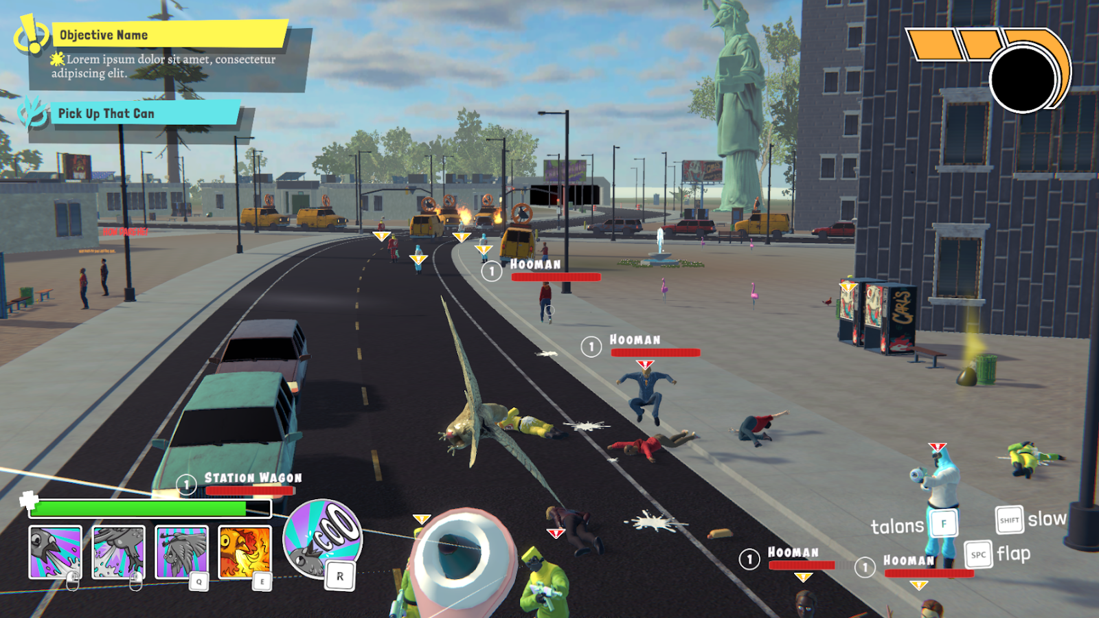
We have been constantly adjusting the flight controls to make the pigeon movement feel both free flowing and responsive. From this we added a Hover Mode to the pigeon’s flying arsenal. While in this mode the pigeon hovers in the air and allows for more precise flying shooting. Transitions into and out of this mode are also totally seamless.
On top of that we added in a new mechanic while flying: Talons! While flying the pigeon can extend their talons to grab any object they are flying over. As well as while their talons are extended they instantly land even while flying at high speeds.
User Reports & Playtesting Prep
Dean Cohen
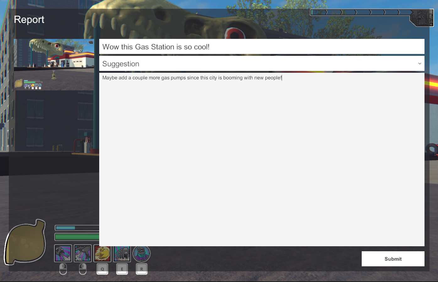
In preparation for our upcoming playtest sessions, we implemented a User Reporting System. This can be accessed at any time in the game to send feedback reports directly to us, with much of the information included to address the issues, such as screenshots, computer specs, and player notes.
